Бренд молочных продуктов из Вологды «О!» глазами AI
The aim of the project is to create an identifier for a brand of dairy products from Vlogda using neuronets. This work demonstrates how artificial intelligence can transform an already existing project by changing its identity and adding additional details.
ON THE PROJECT
Reference to project: https://portfolio.hse.ru/Project/23480
The concept of the project involved the creation of space, as well as of materials and aidemics using neuronets.
REBENDING WITH ASSISTANCE AI
In developing the project, I used resources such as ChatGPT, Ideogram, MyFons and Leonardo Diffusion XL. The logo generation is done with an idegram neuronet, and the search for a font solution is MyFons. Proms are generated in the GPT chat room by asking for and describing the necessary image and details on it: what will be in the image, the style, the palette, the angle, the illumination.
IDENTICA
FLOW
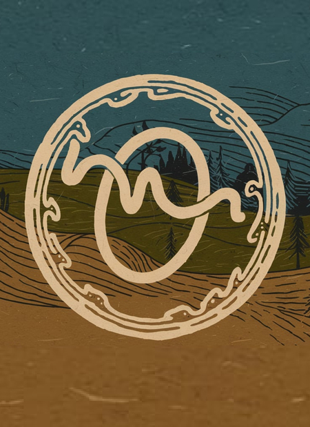
First step, I created Prompt to generate a logo for my fictional company in GPT 4. The Promt I obtained put in the neuroskeleton.
Promt: The logo is a hand-drawn, fluid «O» with a stylized, wavy line inside it. The line has peaks and valleys, representing the natural imperfection and chaos. The letter «O» is placed within a circle made of irregular, hand-drawn lines. The circle is placed on a backdrop of the Vologda region’s landscape, with rolling hills, trees, and a body of water. The overall design has a rustic, organic feel. A palette of earthy tones: a warm beige for the «O», a deep green for the circle, and a rich blue for the background landscape. The beige and green are used to create a textured, hand-drawn effect on the «O» and the circle. The blue is used for the background landscape, which contains rolling hills, trees, and a body of water.
COLOUR
I created a color palette in Adobe Color. I used built-in neurostudents to recognize the shades in the logo I received.
Adobe colord helped create the palette.
TYPRODRAFICS
To choose the font, I used MyFons, and I used built-in neurosnets to recognize the fonts in the logo I received.
The concept of the project involved the creation of space, as well as of materials and aidemics using neuronets.
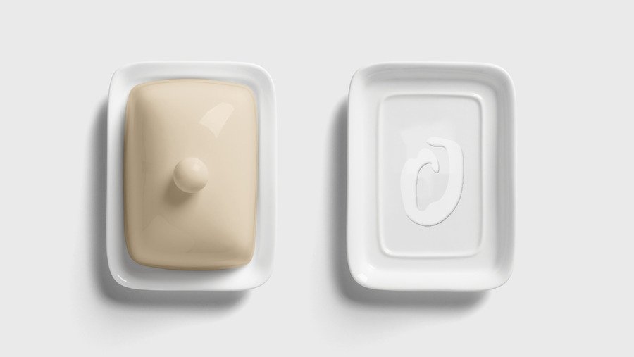
PACKING
Promt: Milk cartons, several of varying fat content (3.2%, 2,5%, 1,5%) and butter. The packaging should feature a logo: a hand-drawn, flowing letter «O» written in Pasta Script Spaghetti font with a stylized wavy line inside. The line has peaks and valleys, representing natural imperfection and chaos. An earthy palette including a warm beige, deep green rich blue.
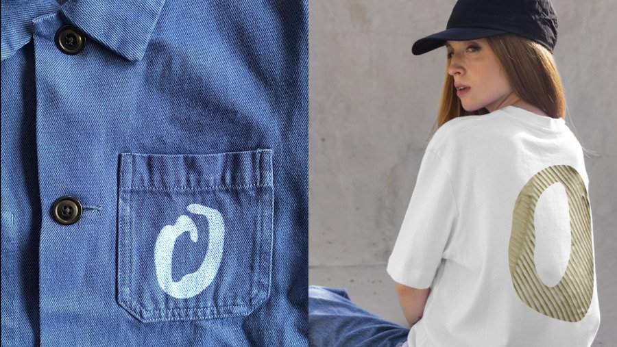
PROMO MATERIALS
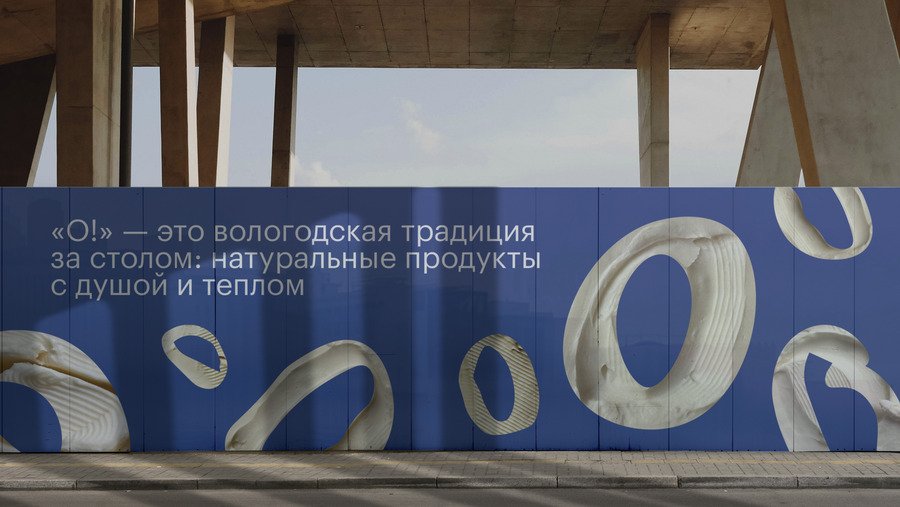
Promt: Photo of a billboard advertising a dairy brand. The Billboard features a hand-drawn, flowing note «O» written in Pasta Script Spaghetti font, with a stilized wavy line inside. The Line has peaks and valleys, representing natural imperfection and chaos. The Brand colors are a warm beige, deep green, and rich blue. The billboard is set in a regular session, with rolling Hills and terms in the background. There\s a cow in the foreground, grazing out the billboard.
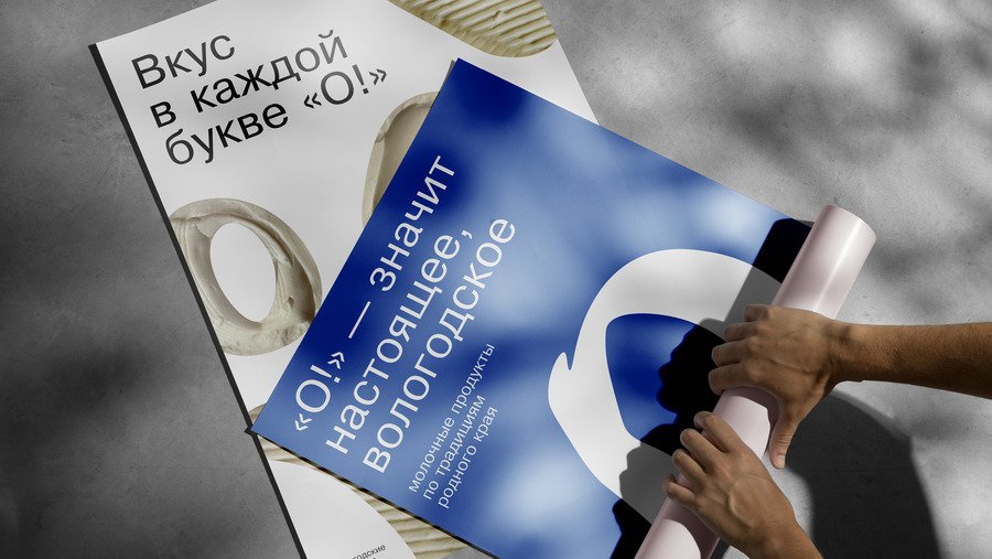
Promt: A photo of advertising posters for a dairy brand. The posters have a hand-drawn, flowing letter «O» written in Pasta Script Spaghetti font with a stylized wavy line inside. The line has peaks and valleys, representing natural imperfection and chaos. The brand colors are a warm beige, deep green, and rich blue.
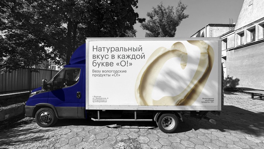
Transport
Promt: A truck with painted in an earthy palette of warm beige, deep green, and rich blue. The logo features a hand-drawn, flowing letter «O» written in Pasta Script Spaghetti font, with a stylized wavy line inside. The line has peaks and valleys, representing natural imperfection and chaos. The logo is placed on the side of the truck.
SPACE
Promt: An interior space for a store for a dairy brand. The space has a minimalist design with an open layout, featuring natural materials such as wood and stone. There are uneven shelves and hand-crafted displays, celebrating natural asymmetry. The walls have exposed brickwork. The floor has a rustic texture. The lighting is soft and warm. There is a tasting station in the corner. The overall atmosphere is inviting and warm, reflecting the brand’s values of authenticity and simplicity.
Tools used


