
ABOUT THE BRAND
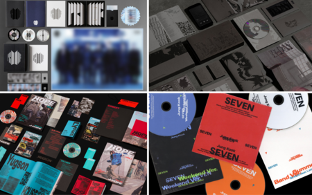
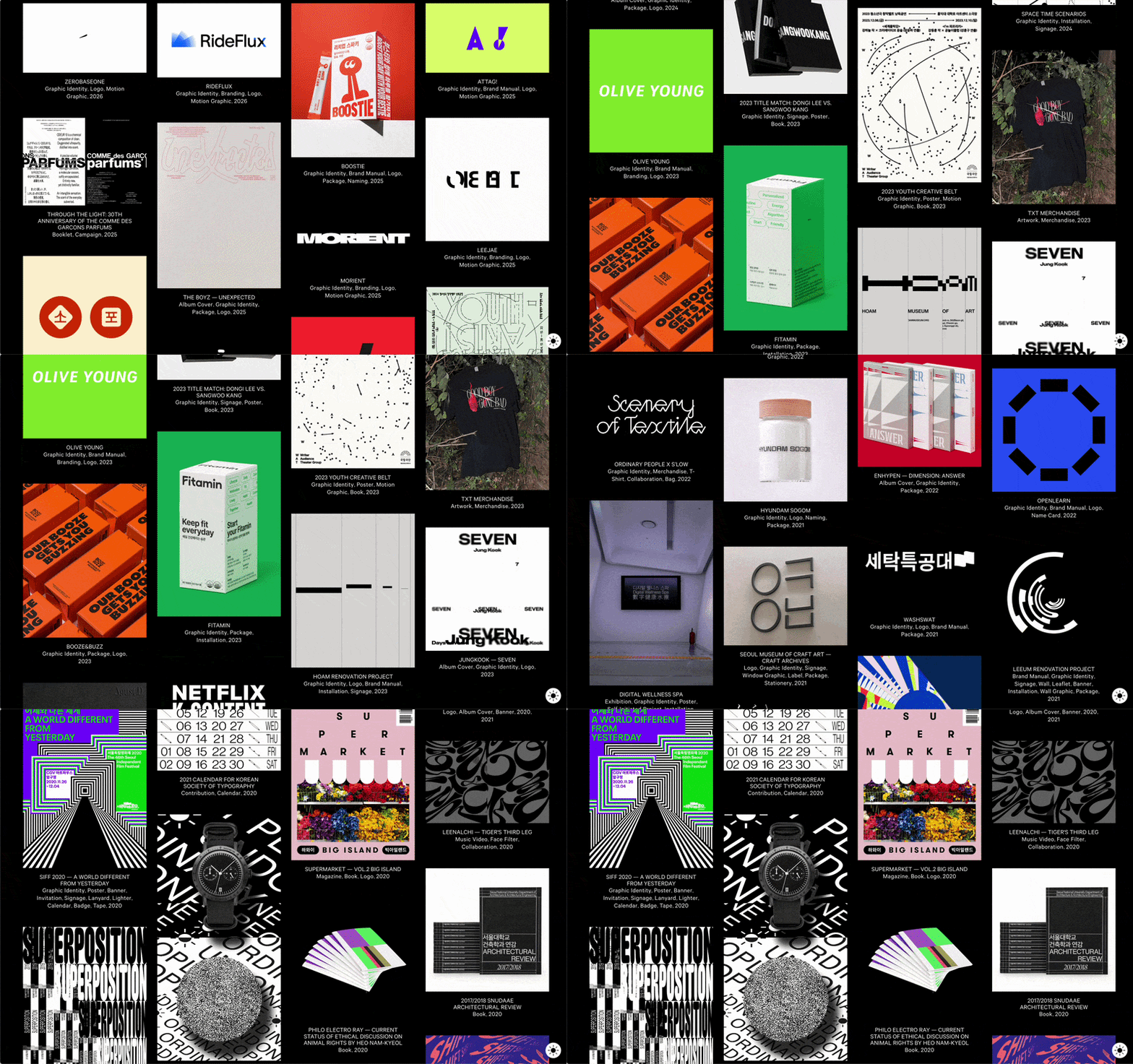
Ordinary People — a design studio from Seoul, founded in 2006 by friends from Hongik University. The studio operates multidisciplinary, developing projects in brand strategy and art direction, covering both cultural and commercial fields. In almost two decades, the studio’s portfolio has accumulated visual identities, packaging, editorial projects, exhibition design, posters, and digital campaigns—including BTS album covers and collaborations with the National Museum of Modern and Contemporary Art of Korea.
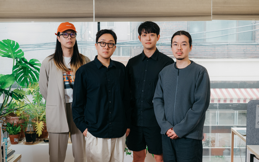
Studio Co-founders: Seyong Ahn, Jin Kang, Jaeha Lee, Jeongmin Seo
BRAND ANALYSIS
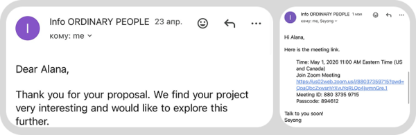
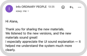
To identify the brand’s characteristics, I utilized two sources: studying publicly available materials about the studio (articles, interviews, portfolios) and direct communication with the team via email and online meetings.
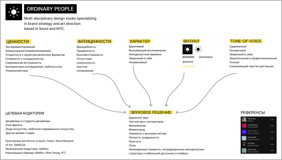
Values — experimentation, research, openness to diverse formats and collaborations, and the pursuit of a unique artistic voice. The team self-identified all of this during correspondence. The portfolio confirms this: the studio collaborates with cultural institutions, commercial brands, music projects, and exhibition spaces without being tied to a single niche.
Anti-values — banality, a lack of originality, and blind imitation. In an interview, the team openly discussed their disinterest in works that merely transplant Western styles into a Korean context. This is a principled stance that has been publicly declared.
Character — confident, attentive, independent. This is evident not only in how the studio describes itself but also in the communication process itself: precise answers, rapid response, and a readiness for new experiences, particularly with sound identity, which they had not worked with before.
Tone-of-voice — restrained, transparent, while maintaining professional distance. This was apparent during correspondence and calls: the team was consistently specific, yet without unnecessary formality.
BRAND COMMUNICATION
I sent the first email at the beginning of the project, and I received a response two days later. The studio immediately confirmed their interest and frankly admitted that sound identity was a new format for them. Throughout the entire process, the team responded quickly and precisely. Regular video meetings and correspondence helped clarify the direction and align on decisions.
CONCEPT
Ordinary People, at first glance, appears to be a minimalist studio with a concise style and a clear visual language. However, upon closer examination of the projects, it becomes apparent that every decision is underpinned by research, experimentation, and an individual approach. I apply this same logic to the identity: the sound and visuals seem simple at first, but they contain micro-elements, textures, and subtle details that unfold gradually.
AUDIO SOLUTION
The brand’s visual identity is minimalistic; the company also emphasizes its value for clarity and precision. Consequently, the sound design utilizes timbres with a sharp, fast attack, with a sine wave serving as the foundation due to its simple and pure sonic structure.
The brand also strives to be contemporary and relevant, so all employed timbres are electronic. Despite the brand’s highly minimalist aesthetic, it is important to convey the team’s approach to work: as they note, they value experimentation, endless exploration, and are open to new experiences and radically different projects. Therefore, the musical solution incorporates subtle melodic structures and micro-dissonances within the intervals.
The brand track is developing steadily and maintains a rapid pace to convey their drive for growth and progress. As they explained during a meeting, their logo (the sun) symbolizes their curiosity about what lies ahead when reaching new heights. The elements of the sonic identity feature a distinct rhythm designed to create a sense of confidence and precision.
It is also important to note the inclusion of micro-elements and textures. These were added not only to convey curiosity, an openness to experimentation, and attention to detail, but also to reflect the brand’s overall approach. At first glance, it may seem simple and straightforward; however, upon closer examination—if one dives deeper into its projects—it becomes clear that there is far more behind every decision: research, the pursuit of unconventional approaches, and a dedication to finding a bespoke solution for each challenge. It is this complexity that makes the brand genuinely engaging and reveals its true character.
Audio Identity
Ambient Track
Atmospheric ambient track for exhibition spaces, presentations, installations, and other offline and digital media.
Logo
A collection of custom sound logos of varying lengths and complexities for use across different content formats. The system includes full versions of the logo, shortened variants, and simplified versions with fewer sound elements. This allows the visual identity to be adapted to various platforms and video runtimes.
6_packshot.wav The final version of the sound logo for outros, closing sequences, and branded packshots.