How communication theory works in design
Communication in design is the initial and most important element. It is the strategic transmission of meaning, ideas, emotions to the audience through visual elements, texts and other means, creating a common «language» between the brand and the consumer to form the desired perception, trust and motivation to act. Design is not just a combination of beautiful pictures and bright elements, it is a psychological and analytical structure that creates a clear, convincing and memorable message. Within the theories presented in the course «Communication Theory», design is not a static object — it acts as a mediator in the exchange of meanings. And the main job of the designer is to express the complex in simple language.
A knowledgeable designer will use key categories of visual communication in order to find a response from the audience, which interprets visual elements in accordance with their cultural experience. This is influenced by:
Color — forms a mood, attracts attention, creates associations; Fonts — the size and readability affect the perception of the text; Forms and lines — basic elements that create structure, movement and define the boundaries of objects Illustrations — convey emotions and meanings, enhancing the message and making it clearer; Composition — the organization of elements on the screen, creating a hierarchy and balance to direct the user’s gaze; Space — the negative space between elements that helps to focus on the main thing and improves readability.
Given Marshall McLuhan’s theory of media ecology, in modern design, the consumer is the one who sets the mood and determines the message. They are the content that the designer uses when forming a brand. To do this, the characteristics of the target audience, problems, insights and behavior are studied.
The latter is closely related to the theory of «Planned Behavior», formulated by Icek Ajzen.
For our «RAGEMELTS» design becomes a way to support and direct the burnout of the audience in the right direction. The choice of color and graphics turns into a system that offers safe sublimation of destructive impulses through play, culture and reflection.
The logic of message design helps to structure the brand’s approaches to work:
With the help of expressive logic — expression of design vision, relief, release. Using traditional logic — following the norms of cognitive-behavioral therapy (self-reflection, therapy). Using rhetorical logic — adapting the design to the needs of customers to help identify negative emotions, cope with burnout.
Presentation for a wide audience
While the foxes Took RAGEMELTes, Walked across the grassy lea And set fire to the sea How it burned and how it smoked! Out a whale’s great muzzle poked; «Fire!» The whale began to shout, «People, help us, put it out!»
Discover RAGEMELTS — a brand that doesn’t just vent destructive thoughts, but offers a culturally accepted, safe, and reflective space to channel them. Experiencing burnout? Is your work or studies a source of burning hatred? Do you ever feel a burning desire to set everything ablaze? Our candles are your secret companions, helping you uncover, define, and give a name to your hidden feelings — all without feeling like a whirlwind of emotions!
Remember these guys?
K. I. Chukovsky, «Confusion», 1924.
That’s where they are now (Yes, only one remains, tucked away in a psychological clinic).
Morse A., «The Stubborn Fox», 2013.
The foxes, in their desperation, set the sea ablaze, a final act born of a path with no other end. Once upon a time, it was a childhood dream, but now, we all sometimes find ourselves echoing the whispers of those little foxes. Sometimes life just gets so infuriating, you feel like you want to… symbolically set everything on fire.
Is your brain on fire? Is your work giving you a run for your money? Setting fire to work folders is a disaster waiting to happen. Lighting a candle made of work folders is a moment of reflection, a question: «What is truly ablaze in my life?» Tune into your heart. Ignoring your feelings is a recipe for disaster.
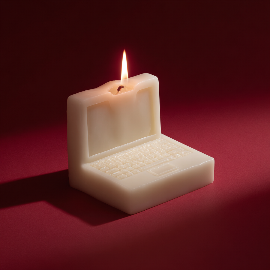

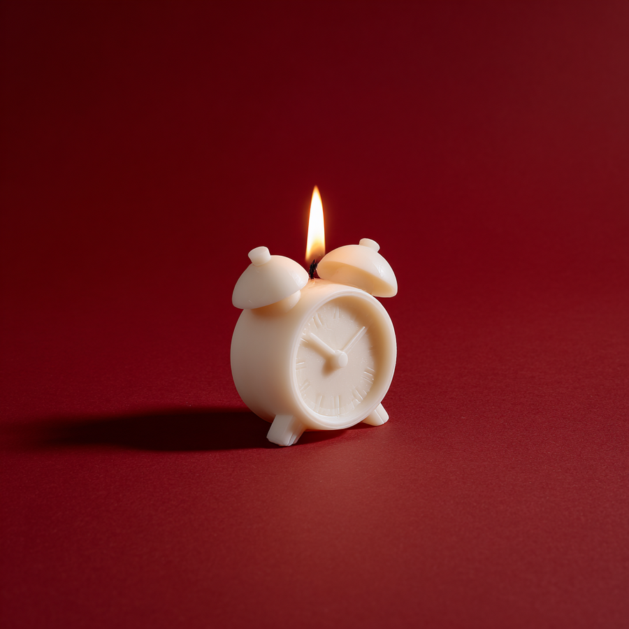
Minimalist still life photography, single sculptural candle shaped like a human brain, pure white wax, small flame burning, placed inside crumpled brown kraft paper, monochrome deep red background
Any shape, any form, any expression. We craft candles shaped by the things that stir your emotions — the ones that infuriate, delight, weigh you down, or simply make you laugh. So you can… well, you get the idea. It’s a symbolic gesture.
Choose what ignites your passion today. Ignite it. Behold the dance of the flame. Let your emotions dance and burn with the wax, releasing their power. Unleash a manic laugh (optional).
Rather than letting the urge to tear everything down fester, you unleash it. Securely embraced, with a whisper of vanilla. And a playful wink of self-awareness.
We’re crafting a sanctuary where you can breathe new life into your spirit, transforming burnout into growth through gentle reflection and a touch of humor.

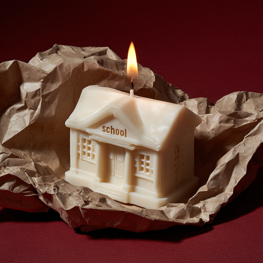
Minimalist still life photography, single sculptural candle shaped like a small school building, pure white wax, small flame burning on the roof, the word «school» clearly written on the front facade


Minimalist still life photography, single sculptural candle shaped like a mop with a bucket, pure white wax, mop slightly angled resting in the bucket, small flame burning from the top of the mop hand
Presentation for a professional audience
RAGEMELT is a brand concept for scented candles, designed as a tool for reflection and emotional well-being for Generation Z and millennials.
Diagnosis (problem) of the era:
Burnout, anxiety, and the language of self-irony. The target audience uses humor and memes as a defense mechanism and their primary means of communication. Tabooed destructive fantasies are a symptom of accumulated stress. Hypothesis: There is a need to legitimize these emotions and provide a safe, socially acceptable outlet for them.Chukovsky’s «Little Foxes» as an archetype:
Drawing on a common childhood archetype (the image of foxes burning the sea) to instantly establish a connection and create a metaphor. We are also reinterpreting the myth — the tragedy of the chanterelles lies in the absence of a safe channel. Our goal is to provide such a channel. The key metaphor is a controlled fire versus a chaotic blaze. Sublimation through ritual and dialogue with the audience in their language.Minimalist still life photography, single sculptural candle shaped like a minibus, pure white wax, minibus slightly angled, small flame burning from the top edge or roof, minimal vehicle details
How it works:
A candle is a physical embodiment of a problem (such as the brain, work, or debt) and the materialization of an abstract feeling. The act of burning is a simple, ancient ritual of transformation and purification. The visual disappearance of an internal problem. The history of fire as a ritual is deeply rooted in our world, reflecting its ancient symbolism; the first fire was a miracle. Reflection (grounding) — «What do I truly want to let go of in my life? Feeling lonely, insecure, or down because of an excess of melatonin?»Brand identity follows the trend of simplification in design.
It is based on the following components:— Concise colors (white, black, and orange). The white airy space symbolizes the client’s consciousness, its boundlessness and purity. Black is the dark spot of anxious thoughts. Orange is the tiny flame of our candles, which can succeed in improving the client’s mental state.
Selection of colors for corporate identity.
— A modern logo based on a modern high contrast antiqua with well-defined, recognizable features. The letters stick together, conveying the idea of melting wax and human problems simultaneously.
Corporate identity logo.
— A matchstick pattern that carries the red thread of the obsession with arson, as considered by our brand. — The Montserrat typeface. The pairing of a charismatic serif in the logo and a simple sans-serif in the text works excellently in contrast. Moreover, this font is optimal for the readability of technical information.
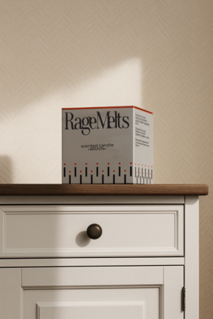
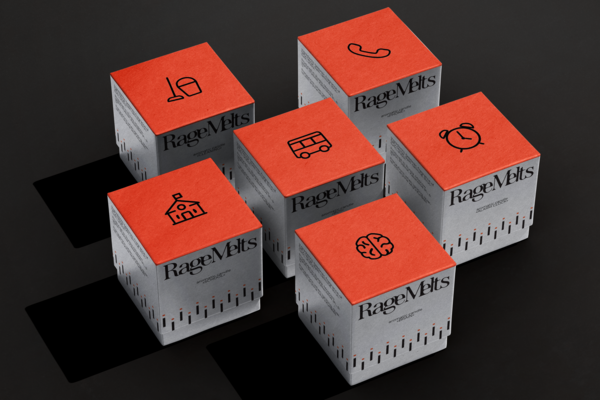
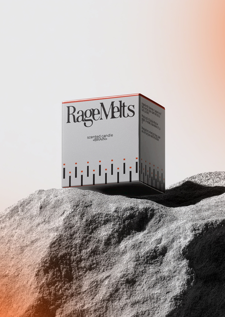
RAGEMELT packaging design.
Foundations of composition in brand identity:
— The advantage of negative white space, making packaging and other media concise and understandable to the client. This is done to balance the brand’s color scheme. Candles themselves are bright design objects, so the packaging «calms» the brand’s visual code. — The black «melting» logo is always placed at the top of the brand style media. Since the logo is closely tied to the metaphor of wax, it is logical to use it in this way, as a candle’s melting begins from the top. — The overall composition is predominantly center-aligned, as a connection to the round candle, where everything is also centered (to the wick).



