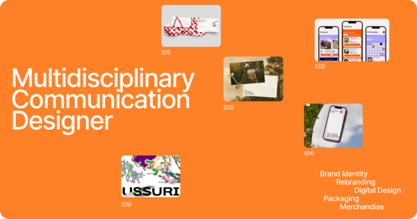
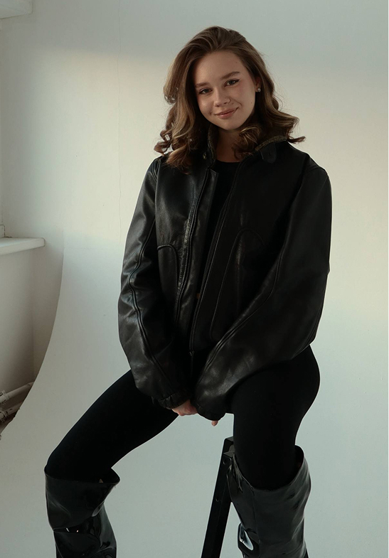
I’m Vitaliya Kashanskaya, a communication designer currently in my fourth year at HSE School of Design.My work spans different areas of visual communication, including branding, visual identity, packaging, and editorial design. I enjoy experimenting with typography, color, and composition, exploring unconventional ideas and finding creative solutions that give each project its own distinctive character.
DESIGN IS ABOUT BREAKING EXPECTATIONS!
Every visual decision shapes how an idea is perceived. Typography, color, composition, and form create a unique visual language that makes a project recognizable and memorable.I believe the most interesting design emerges through experimentation, unexpected combinations, and the freedom to challenge familiar approaches.My goal is to transform ideas into bold, distinctive visual experiences that capture attention and leave a lasting impression.
Projects
Communication and Industrial design
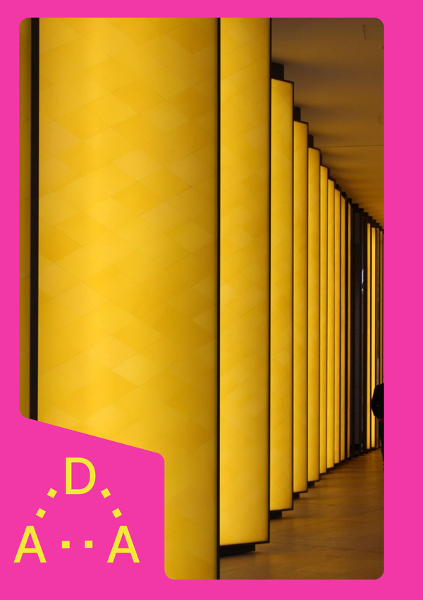
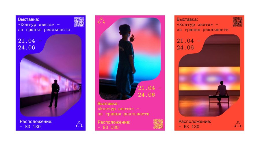
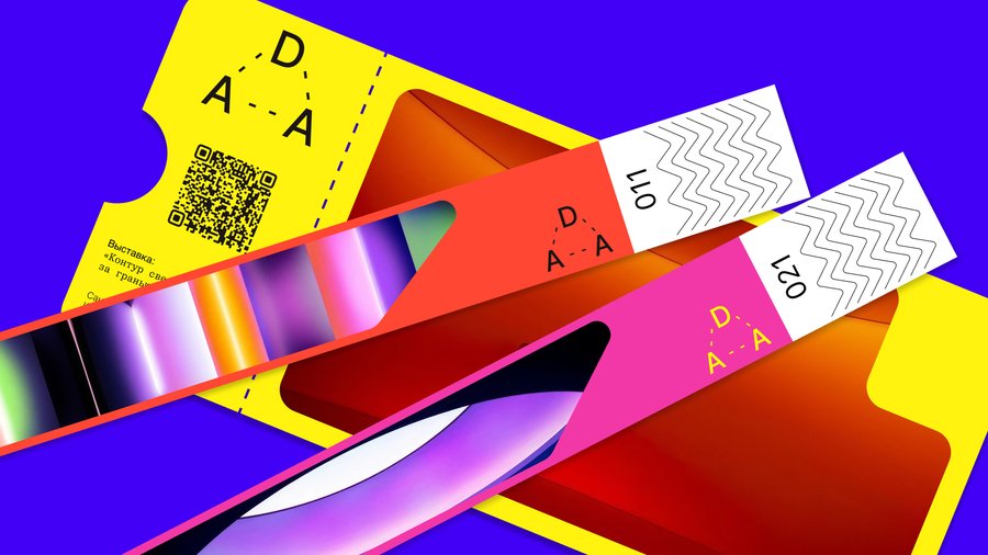
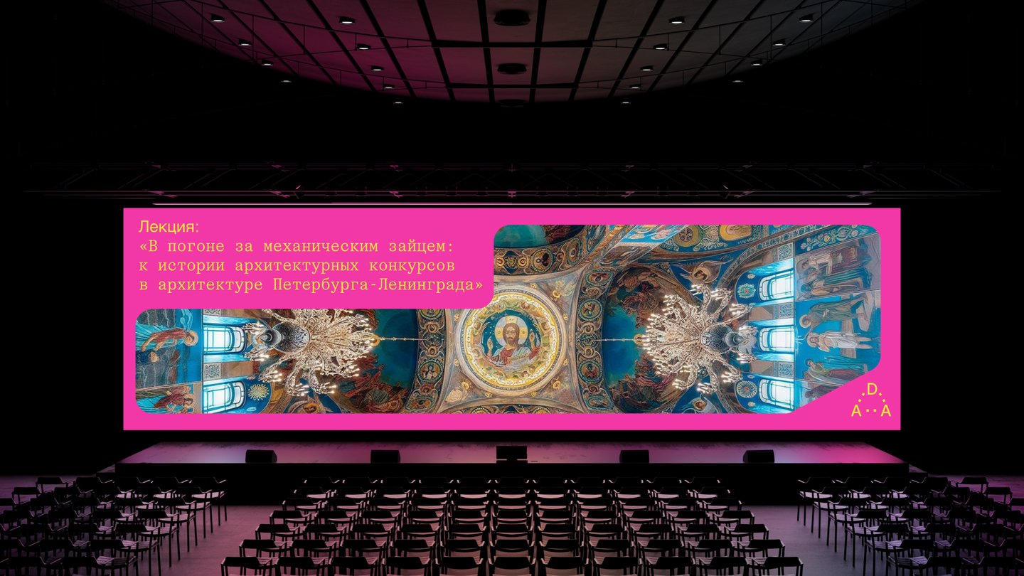
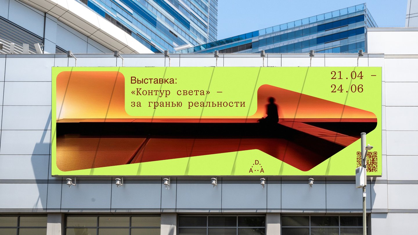
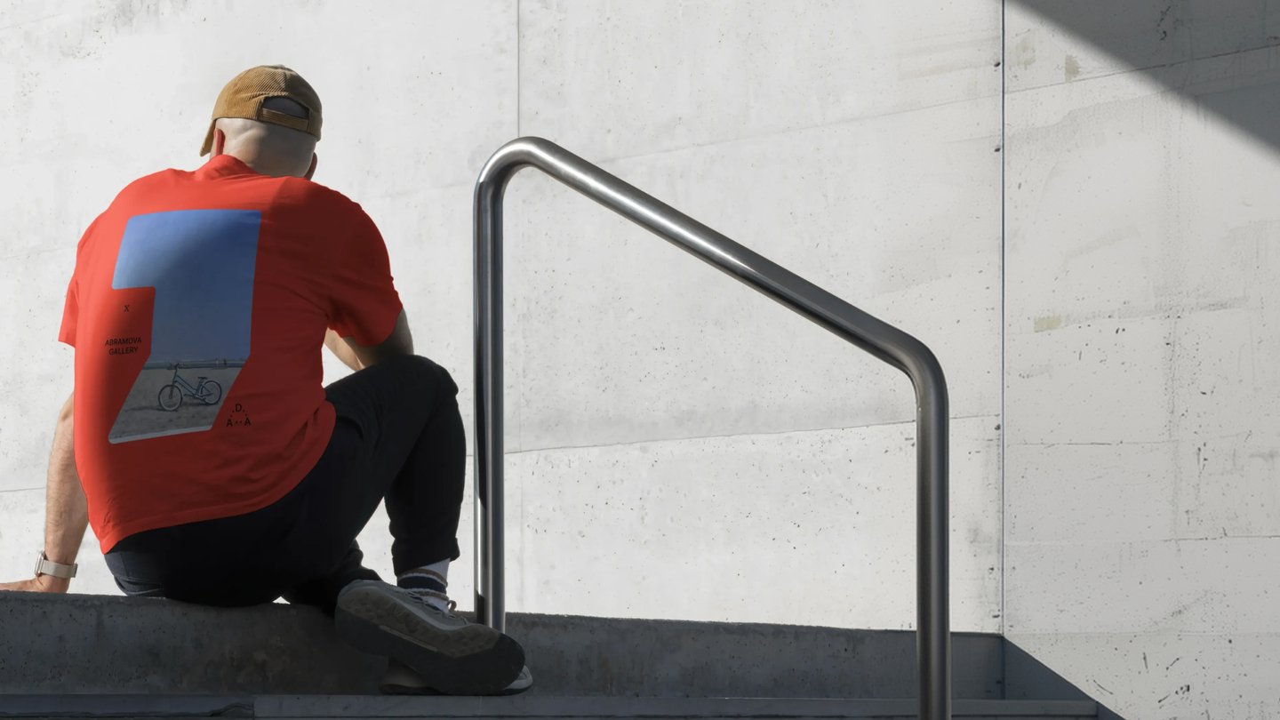
DESIGN DISTRICT DAA Branding · Visual Identity · Visual CommunicationThe Brief: Develop a visual communication system for Design District DAA, a creative ecosystem bringing together art, design, and architecture. The identity should reflect its mission to connect creative professionals, inspire new ideas, and encourage collaboration.The Idea: The concept is built around the metaphor of a window into another world — a space for new perspectives, ideas, and possibilities. Inspired by architectural structures, the visual language is based on three geometric points referencing the letters DAA. The shapes transform and evolve, reflecting the constantly changing world of design and architecture.The Solution: I developed a flexible visual system combining dynamic geometric frames, bold color combinations, and expressive typography. The identity was applied across exhibition posters, event communications, and large-scale environmental graphics.The Outcome: The project resulted in a cohesive visual identity that connects different creative disciplines while giving each event its own distinctive character. The system can be adapted to a variety of formats and communication needs.
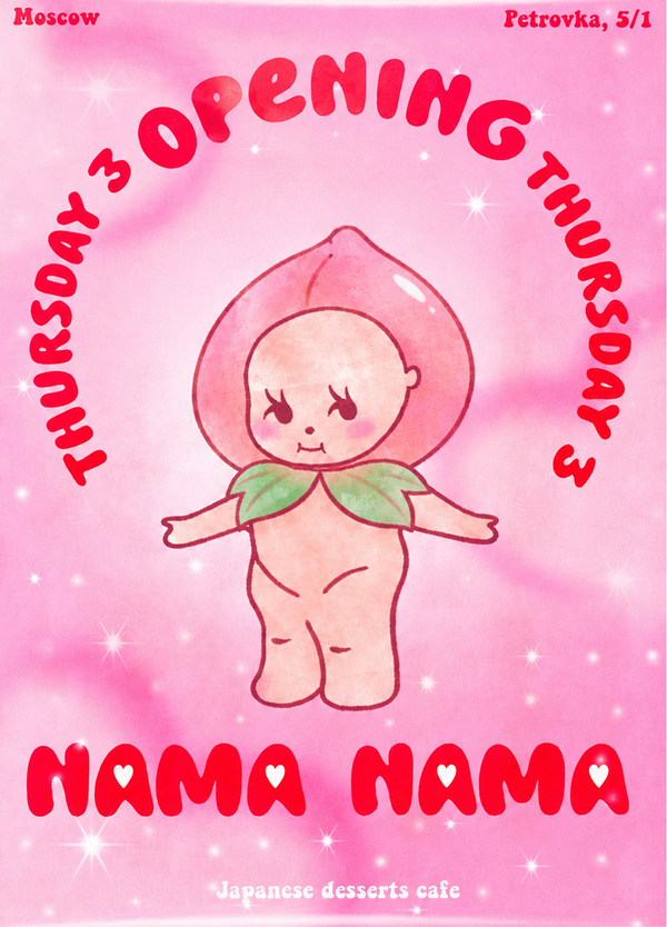
NAMA NAMA Branding · Packaging · Visual Identity · Visual CommunicationThe Brief: Develop a brand identity for Nama Nama, a Japanese dessert café, introducing traditional Japanese sweets to a Russian audience through a playful and recognizable visual language.The Idea: How can Japanese culture be translated into a fun and approachable visual identity? Inspired by the sunset and Japan’s association with the rising sun, the concept combines soft pink gradients, dreamy atmospheres, and charming fruit-inspired characters to create a sense of warmth and joy.The Solution: I developed a playful visual identity featuring expressive typography, illustrated mascots, vibrant pink tones, and sparkling details. The system was applied across dessert packaging, promotional posters, and brand communications, creating a cohesive and recognizable visual experience.The Outcome: The project resulted in a distinctive brand identity that makes traditional Japanese desserts feel approachable and appealing to a younger audience. The visual system can be extended across different products, packaging formats, and promotional materials.
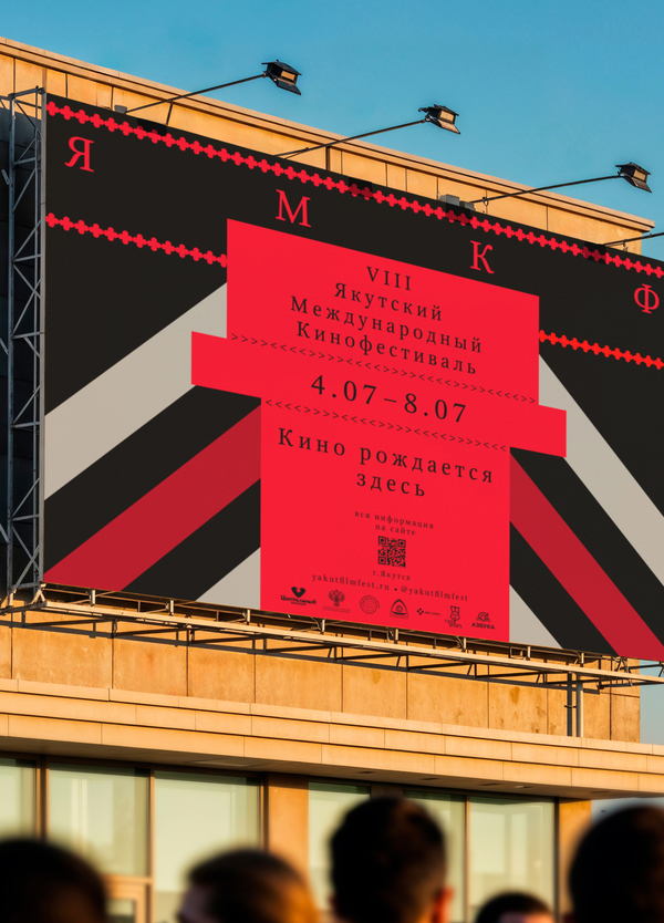
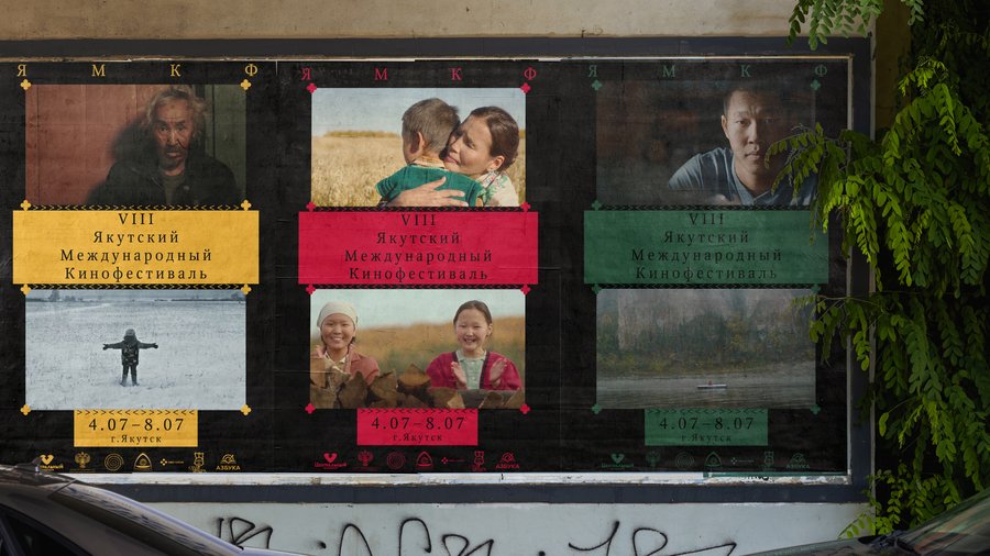
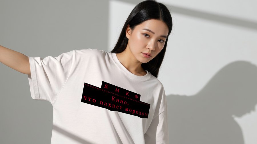
YAKUTSK INTERNATIONAL FILM FESTIVAL Branding · Visual Identity · Visual CommunicationThe Brief: Develop a visual identity for the Yakutsk International Film Festival that reflects the cultural heritage of Yakutia, supports national cinema, and establishes the festival as a platform for cultural exchange and creative dialogue.The Idea: How can the identity of the North be expressed through contemporary graphic design? The concept draws inspiration from Yakut cultural traditions, symbolic ornaments, and the poetic atmosphere of northern life. The visual language connects cultural memory with contemporary cinema, celebrating local identity and storytelling.The Solution: I developed a flexible visual system combining traditional decorative motifs, expressive typography, and a distinctive color palette. The identity was adapted across festival posters, tickets, merchandise, social media, and promotional materials, creating a recognizable visual language.The Outcome: The project resulted in a cohesive festival identity that highlights the cultural uniqueness of Yakutia and supports the festival’s positioning as a platform for national cinema. The system creates opportunities for consistent communication across digital, print, and environmental formats.
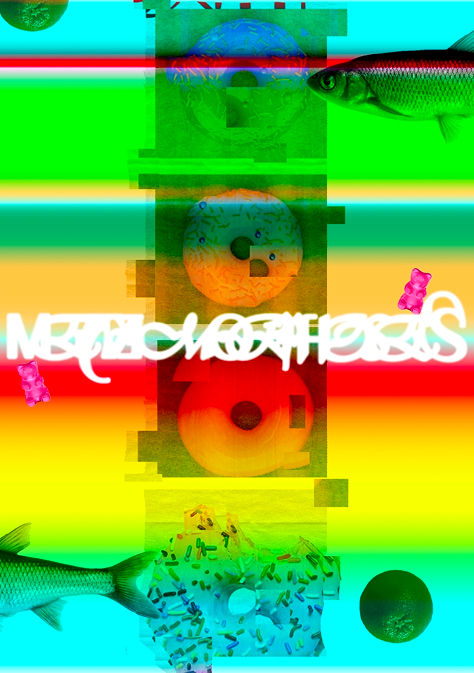
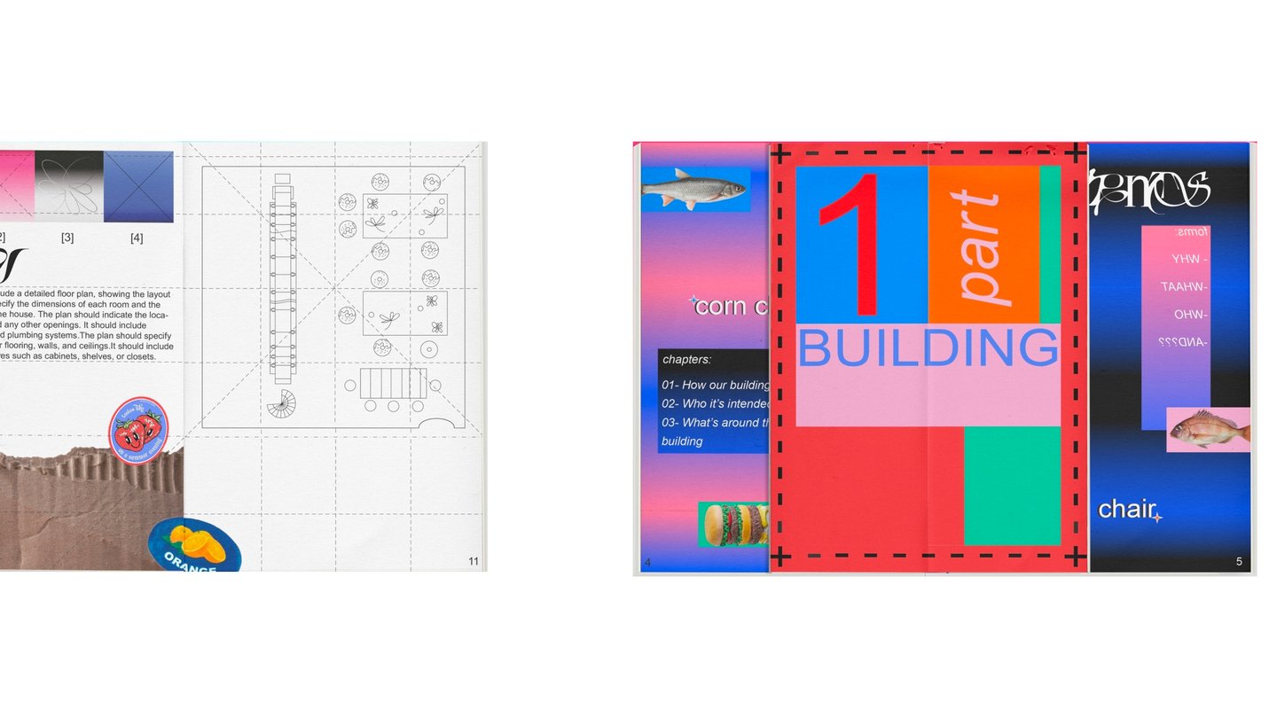
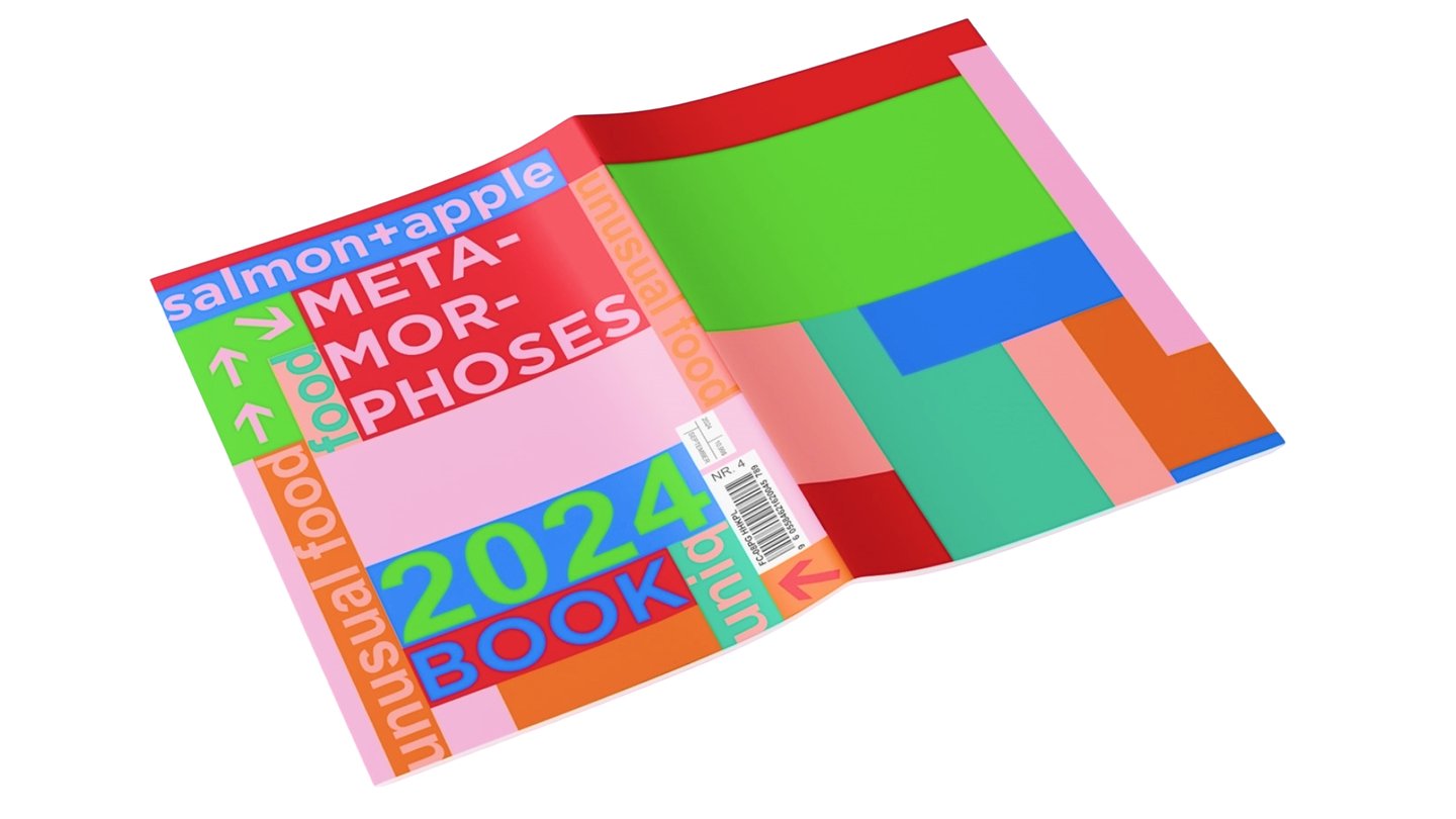
METAMORPHOSES Branding · Editorial Design · Visual CommunicationThe Brief: Develop a visual identity for Metamorphoses, an experimental company that transforms discarded food from around the world into unexpected new products. The identity should communicate the ideas of transformation, sustainability, and creative experimentation.The Idea: What if food waste could become something entirely new? The concept explores metamorphosis through unexpected combinations of familiar objects, distorted imagery, and experimental compositions. Everyday food becomes a starting point for new forms, meanings, and visual experiences.The Solution: I developed a bold visual language combining saturated colors, digital distortion, experimental typography, and surreal food imagery. The identity was translated into an editorial publication featuring unconventional layouts, graphic experiments, and playful visual contrasts.The Outcome: The project resulted in an experimental visual identity and publication that explore the creative potential of food transformation. The visual system challenges familiar perceptions of food and communicates the brand’s unconventional approach to sustainability.
Projects
3D
3D TYPOGRAPHY EXPERIMENT The Brief: Explore the possibilities of 3D typography through materials, lighting, and animation, creating an expressive visual composition.The Idea: Transforming typography into a dynamic, almost liquid form. The concept explores the interaction between light, reflective surfaces, and distorted letterforms to create a futuristic, digital aesthetic.The Solution: I created a 3D typographic animation combining metallic textures, iridescent reflections, glowing effects, and dramatic lighting against a black background.The Outcome: The experiment resulted in an animated typographic composition that explores the expressive potential of 3D design, turning lettering into a striking visual object.
Let’s create together!
I transform unconventional ideas into bold and distinctive visual solutions, combining creativity, experimentation, and a fresh perspective on communication design.
Available for collaborations in
Branding · Visual Identity · Packaging · Poster Design · Art Direction · 3D Design
Let’s create something together!
Email: vitaliyakashanskaya@gmail.com
Telegram: @vitaliyakas