Hi, I’m Katya
I’m a communication designer focused on typography, exploring the relationship between content, form, and material through books and object design.
I collaborate with cultural and educational institutions, studios, and brands to create thoughtful visual identities, publications, and objects.
how do I work
Challenge → Research → Concept → Visuals → Production
«Modular City: Richard Rogers»
Book Design
Исходный размер 1500x1010
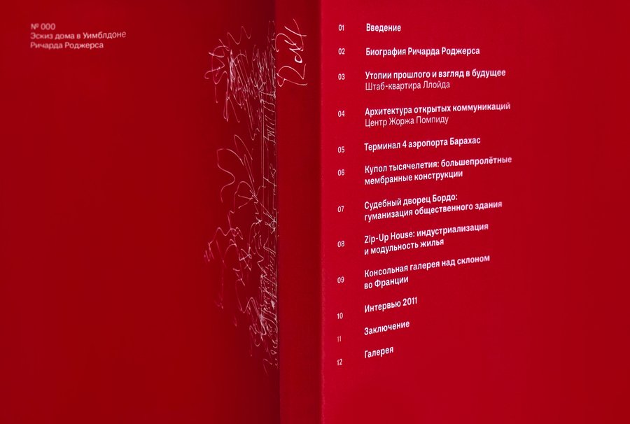
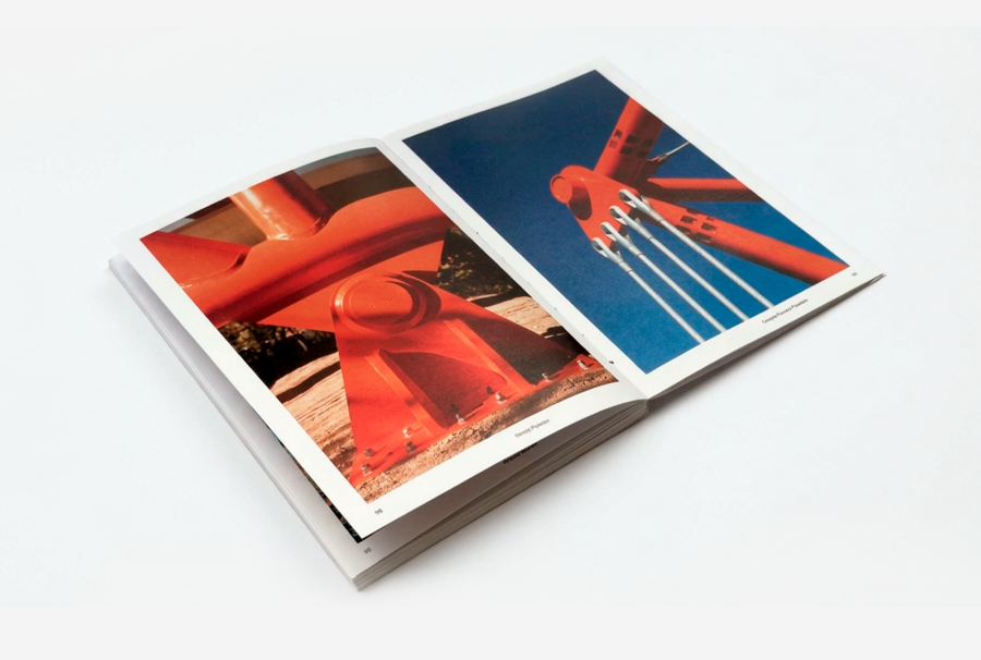
A book that explores the architecture of Richard Rogers, one of the leading figures of high-tech architecture.
problem --> idea
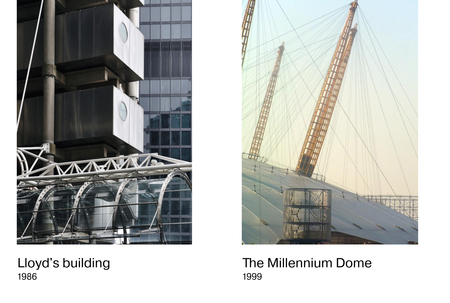
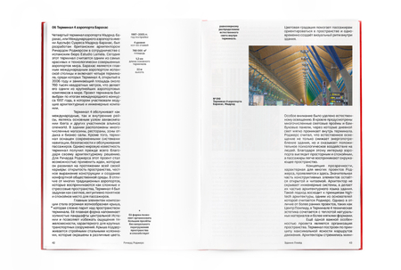
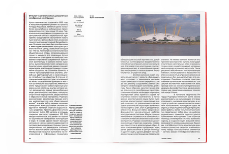
The main challenge was to translate the visual language of Rogers’s architecture into typography and editorial layout. Drawing on the structural logic and visual rhythm of his buildings, I developed a layout that reflects the architect’s approach to form, structure, and engineering.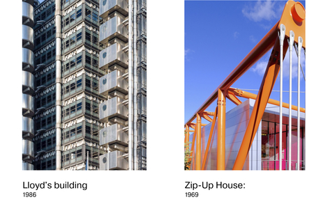
solution
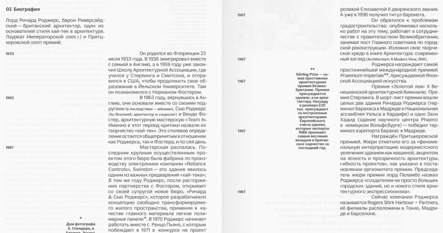
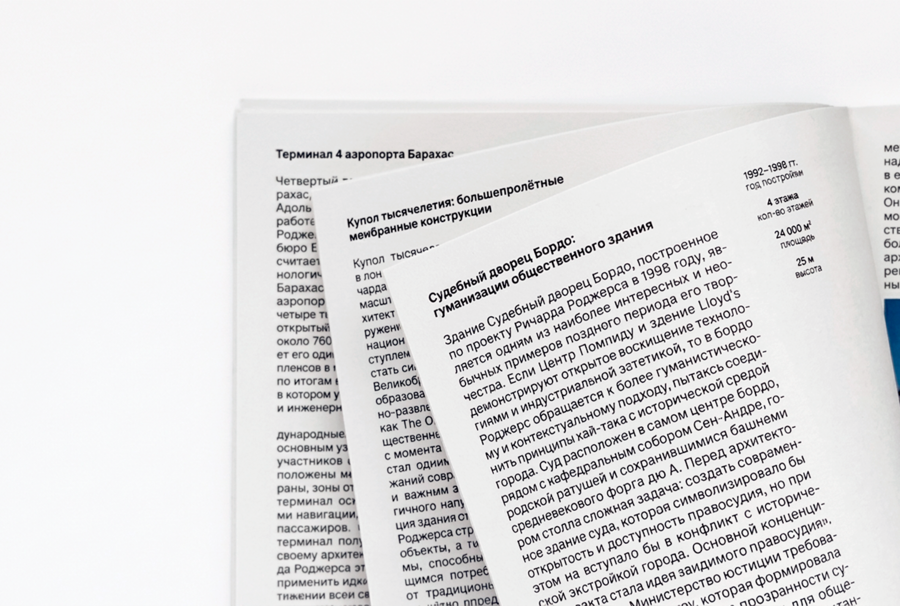
A rigid grid and densely set text echo the modular structures of Rogers’s architecture and the raw, monumental aesthetic of Brutalism. The layout translates these architectural principles into a typographic system.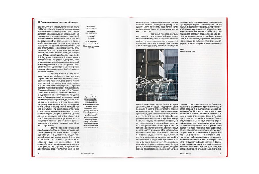
1/2
My Role
I designed the book’s layout and typographic system, and collected and organized all textual and visual materials for the publication.
Исходный размер 1502x1010
1/2
«Braun vs Olivetti»
Book Design
Исходный размер 1500x1010
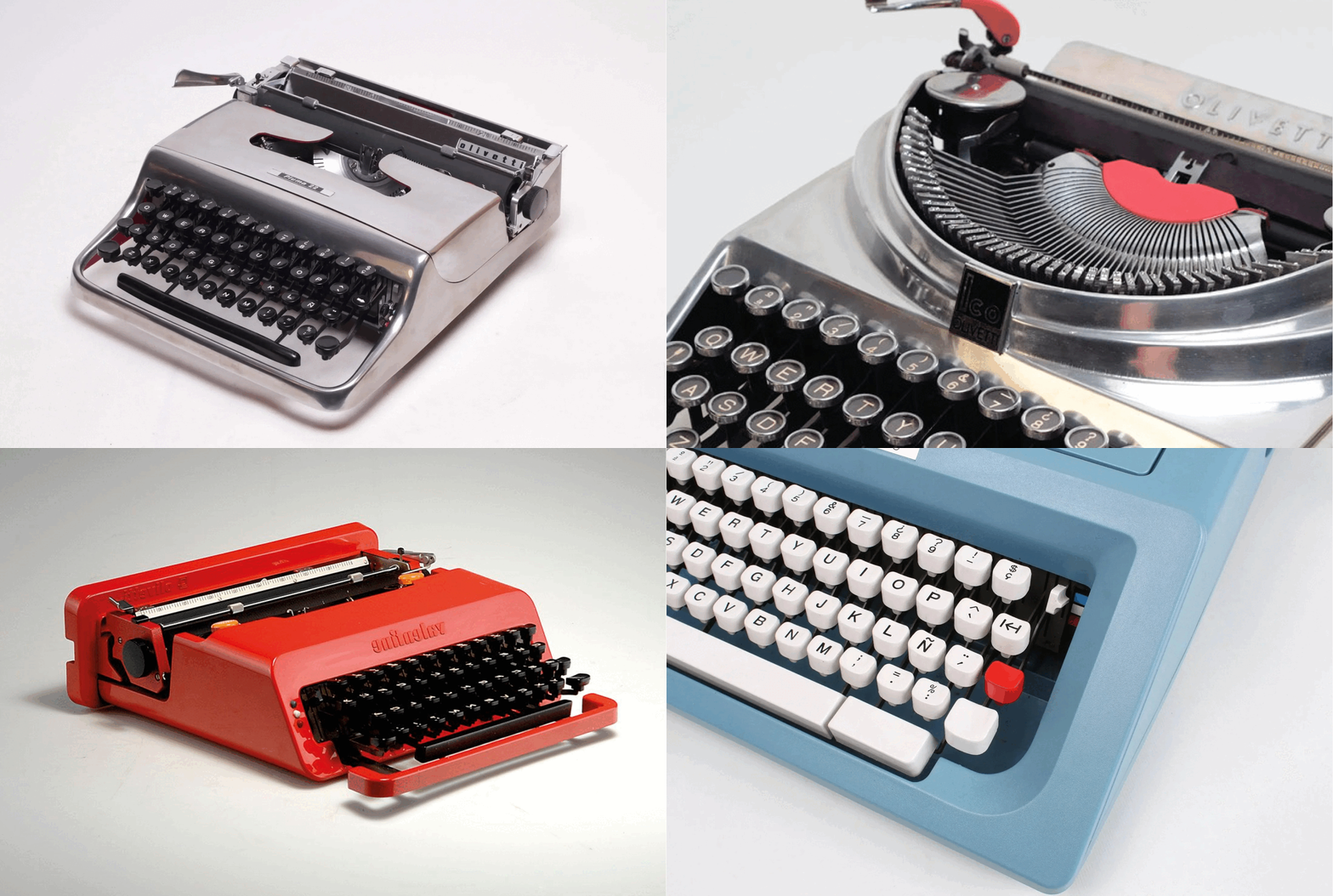
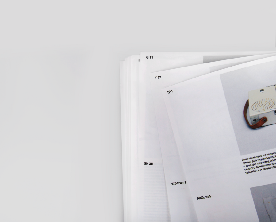
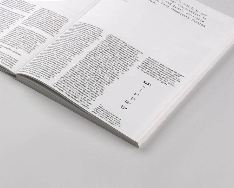
This book analysis two leading industrial design companies of the 20th century, Olivetti & Braun.
problem --> idea
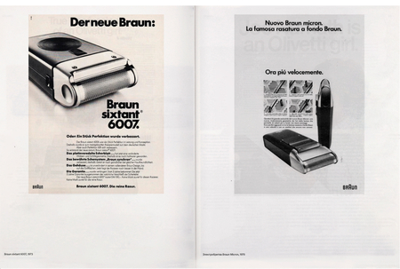
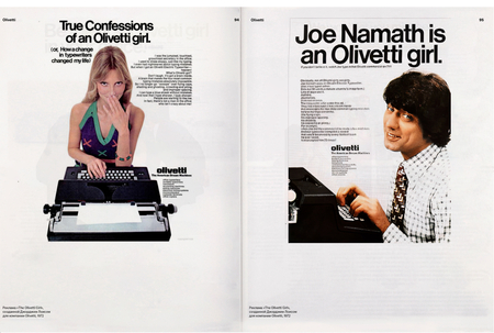
Although both were influenced by modernist ideas, they developed distinct design philosophies. The main challenge was to structure the publication as two separate parts while creating a smooth transition between them.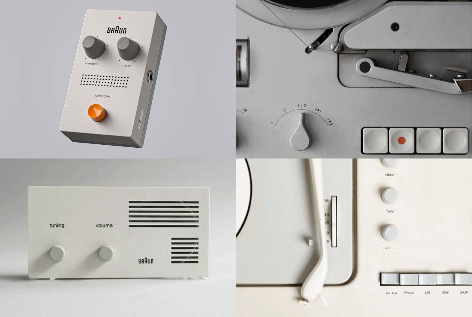
solution
The book is structured in two parts, each dedicated to one company. The transition between them became a central element of the publication, expressed through a section devoted to advertising. This section creates a visual and conceptual bridge between the two design philosophies, connecting the parts while preserving their distinct identities.Исходный размер 1502x1010
1/2
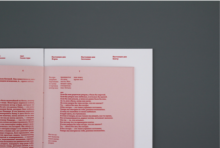
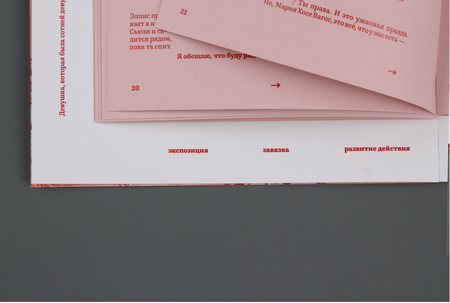
«A girl who was a hundred girls»
Book Design
Исходный размер 1502x1007
The play tells the stories of young women who find the strength to overcome personal challenges.
problem --> idea
The main challenge was to balance the apparent innocence of a teenage story with the seriousness and emotional depth of its themes, while making the complex narrative easy to follow.Исходный размер 1502x1010
solution
The design creates a contrast between a seemingly naive, feminine aesthetic and the maturity of the stories themselves. Pink tones and delicate floral patterns evoke the visual language of a girl’s room, while carefully considered typographic details reveal the complexity beneath the surface.