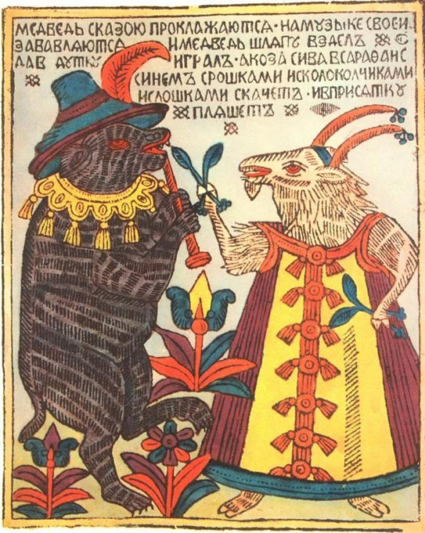
From Folk Grotesque to Ideological Propaganda: Visual Techniques of Lubok Prints and Soviet Posters in Historical Context
Hypothesis
Lubok is a folk visual art form that became the foundation for creating «folk» Soviet posters during the Civil War era. It involves preserving characteristic features and techniques, such as hyperbole, grotesque imagery, the use of folklore texts, and multi-panel composition. The adaptation of visual techniques from Lubok images—which served both entertaining and didactic functions—to meet the new agitational and ideological goals of the Bolsheviks.
Research Objective
Analyze Russian lubok, focusing on its stylistic and visual techniques. Investigate borrowings and methods of transforming lubok imagery, and how these images were reinterpreted in propaganda posters of the Civil War era.
Research Objectives
— Analyze the characteristic visual traits and artistic techniques of traditional Russian lubok (grotesque, hyperbole, storyboard, folklore motifs). — Determine the similarities and differences with Soviet posters from the Civil War period (compositional features, color palette, typography treatment). — Identify the reasons for adapting lubok methods to new ideological objectives (agitation, mass mobilization).
Defining and Historical Context of Lubok
Lubok refers to folk prints featuring various imagery and captions. They are immediately accessible and understandable because they were designed for mass distribution. Luboks began to develop in the 17th century, combining both secular, everyday scenes and religious narratives. They often carried a satirical tone, serving as a form of social critique. The term itself originates from the name of the upper layer of linden wood—"Lub.»
Origins and Dissemination
As mentioned above, lubok originated in the 17th century as a form of specialized printing and woodblock engraving. The origins of lubok imagery can be traced back to monasteries and lavras, where religious motifs were printed. Nevertheless, the genre later expanded into public life through depiction of everyday and humorous themes. In Russia, lubok achieved widespread popularity under Peter the Great, eventually becoming a component of the people’s visual language. We can clearly see this transition through museum collections, which illustrate the shift from icon copies to secular and satirical miniatures.
Forms and Techniques
Most often, the print run of lithographic pictures was on wood or metal and was hand-colored, which made them understandable and accessible to the general population. Bright colors, short captions, characteristic characters, and simple, clear compositions were used. This is what ensured such widespread distribution in cities and at fairs.
Theme and Meaning
Lubok was often used as a form of social commentary, a vehicle for conveying folk wisdom, and as a unique means of preserving cultural identity amid shifting cultural landscapes. Characteristic of lubok are bright coloration and a coarse line quality; its conventional visual elements include stylization, narrative sequence and storyboard framing, decorative design, and a compact format.
The Sociocultural Function of Lubok in Pre-Revolutionary Russia
Through lubki (popular prints), various purposes were disseminated, such as replacing icons, books, or newspapers; they also fulfilled didactic and educational functions. Due to their accessibility and comprehensibility, they were available to the general population, making them, in part, a means of spreading literacy.
Lino-cut Production Techniques
Initially, popular prints were printed using lino blocks. Their creation involved several stages:
- An artist—often a self-taught individual—transferred the drawing onto the block.
- Next, the drawing was cut out using a specialized tool.
- Following that, the block was coated with ink. Only the raised, inked areas were transferred to the paper under the press; the depressions remained white. This is why the first popular prints were black and white and were printed on inexpensive gray material.
The emergence of printing workshops in the 17th century. A century later, Peter I established the Engraving Guild in Moscow, where top artists who had trained in Europe worked. Instead of wooden blocks, copper plates began to be used, and the stages of the manufacturing technology changed:
- The design was applied to the metal.
- The design was scratched using specialized tools.
- It was then coated with ink and prints were made. This new technology allowed for the addition of fine details and the creation of thin, smooth lines. Furthermore, the printed titles were taken to villages outside Moscow, where women and children would color them, usually using four colors, for a symbolic fee. Although the work was often done sloppily, the bright and cheerful pictures still captured the buyers' attention.
Analytical Imagery
The images featured well-known visual archetypes, such as peasants, merchants, bureaucrats, clergy, and soldiers. All these characters possessed distinctive, recognizable features and poses that established a strong association with the narrative. Why was this done? To ensure the story was comprehensible even without text. However, text was still present—it was simple and clear, aimed partly at the less literate population, and was most often placed beneath the illustration or along the edge of the page. The inscriptions reinforced and complemented the narrative, conveying a moral, an event, or some important thought/quotation.
The key elements of the print composition are highlighted below:
- Multi-panel composition—the division of space into multiple scenes that demonstrate the sequence of the narrative.
- Grotesque and hyperbole—the exaggeration of characters' defining traits.
- Flatness and conventionality—the absence of linear perspective, utilizing symbolic space.
- Vivid coloring—the use of contrasting colors.
- Integration of text and image—text as an inseparable part of the composition.
- Symbolism—the use of recognizable symbols and allegories.
- Primitive style—intentional simplicity to make the artwork accessible to a mass audience.
- Didactics—the instructive function conveyed through visual storytelling.
Typology of Lubok Narratives
Religious Events
Image Analysis: A 17th-century religious lubok with a multi-panel narrative structure. The composition consists of two rows of three panels. Each of the six panels depicts a biblical scene featuring figures surrounded by halos, leading us to conclude their sanctity. The use of contrasting colors, such as red, white, and black, creates strong expressiveness. Additionally, explanatory text in ecclesiastical language is placed beneath each frame to clarify the scene. This technique would later become key to Soviet posters.
Visual techniques: primitivist depiction of figures, flatness, lack of depth or perspective, narrative sequencing, multi-framing.