Letters for Brands


case 01 · tasty
Tolstyak Ice cream
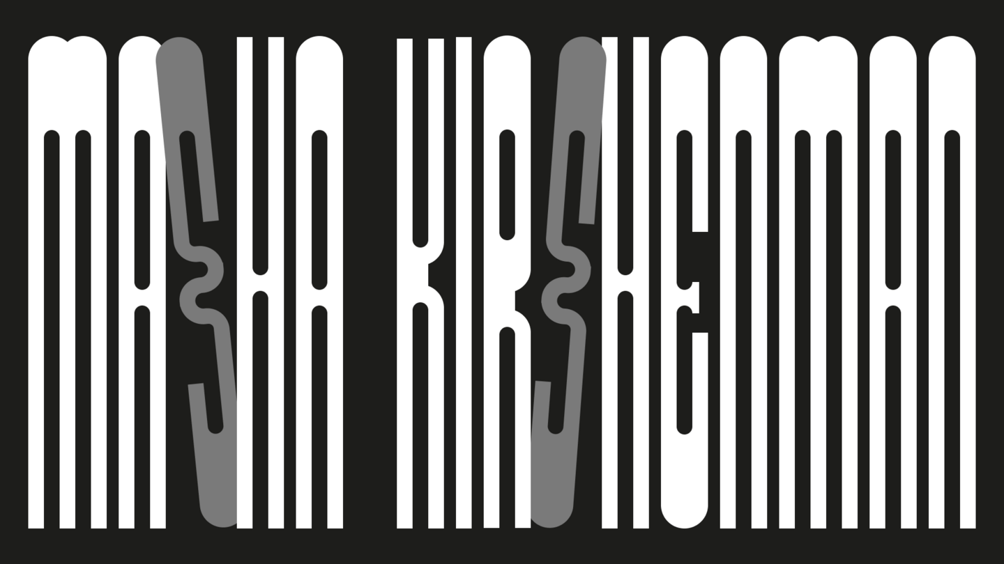
variable typeface
for an ice cream brand
1. I study what
the project is
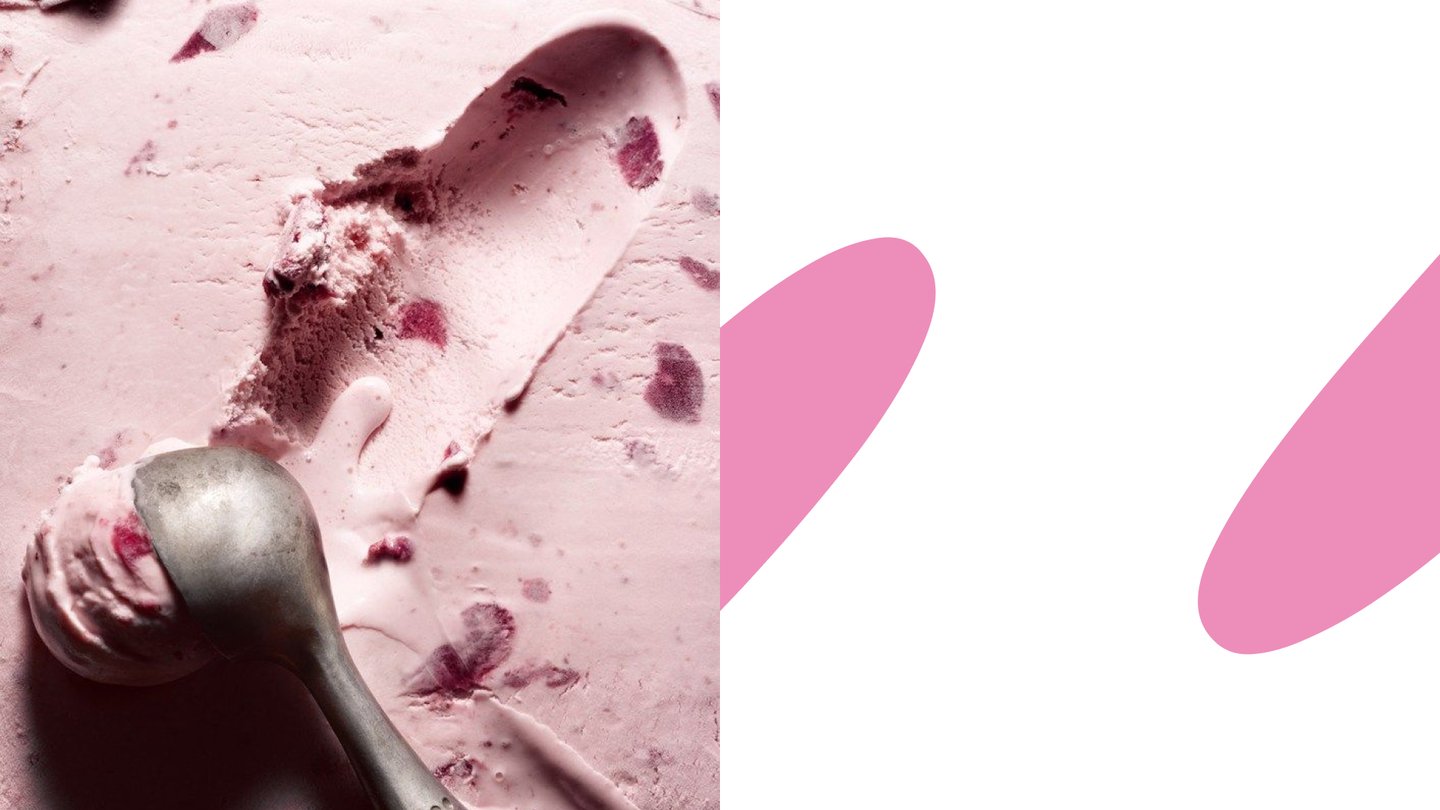
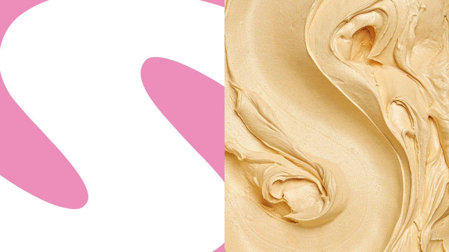
Two sources: Soviet typography of the early 20th century and ice cream itself, studied as a material — how it melts, spreads and stays creamy.
2. I choose
the type the identity grows from
A display face with the dynamics of early Soviet lettering and an appetising, fat creaminess.
3. The letters grow into a brand
In the ice cream branding the typeface meets lively, saturated graphics in the spirit of lebedev and marshak: fresh colours, poster shapes and nostalgia.
case 02 · technical
Polytechnic college of urban economy
variable typeface
alternative identity, student project
1. I study what
the project is
The task: make a college of urban economy stop sounding boring — attract young people and show that being a welder or a heating engineer is modern, technological and even fun.
2. I choose
the type the identity grows from
The base is a welding simulator: everything works like a game — pixels, interfaces, simulators, «melted» shapes and modularity.
3. The letters grow into a brand
In the ice cream branding the typeface meets lively, saturated graphics in the spirit of lebedev and marshak: fresh colours, poster shapes and nostalgia.