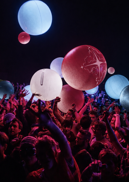
FLARE — световой фестиваль, который проводится на природе, вдали от городской суеты. Это масштабное событие, преображающее пространство и помогающее человеку наконец увидеть то, что он
не замечал — целый мир.
Ребрендинг
Через Claude AI я создала новую метафору для проекта
Новая метафора — временное созвездие
Каждый человек — отдельная звезда, каждый огонёк — часть общей истории.
На одну ночь незнакомцы объединяются в живое созвездие света, эмоций и случайных встреч.
Оно существует лишь здесь и сейчас, рождаясь из присутствия людей и исчезая вместе с последними огнями фестиваля.
Через Chat GPT я сгенерировала основу фирменного стиля: логотип, фирменные цвета, шрифтовую пару и графические элементы
Логотип
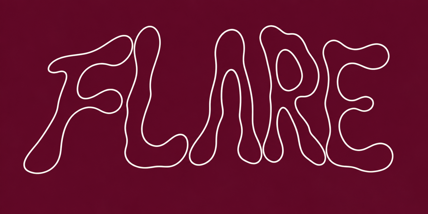
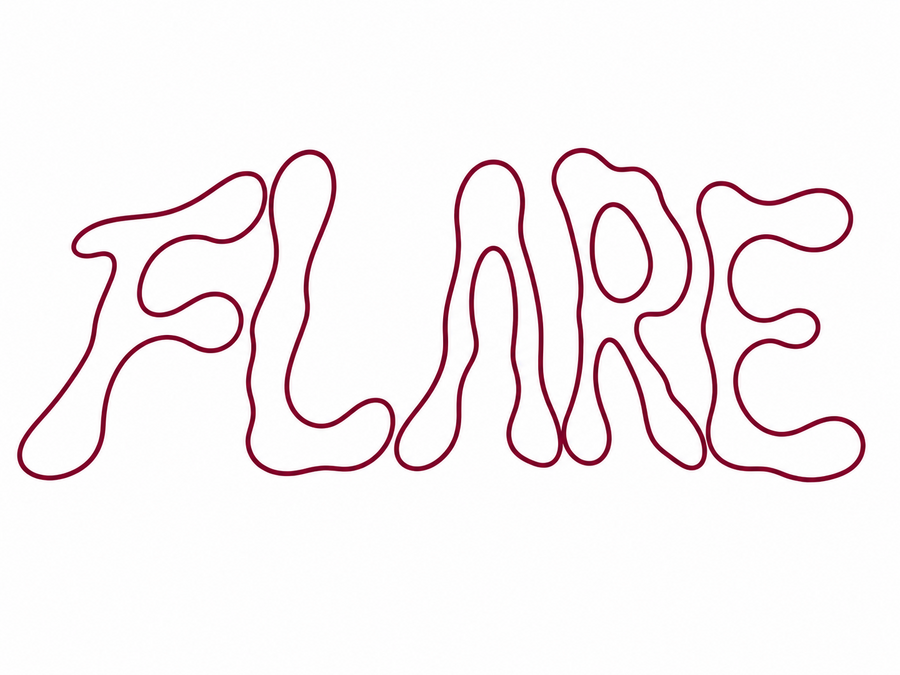
Промт:Create an experimental typographic logo that spells out the word «FLARE.» Design five original uppercase letters featuring elongated, fluid, and flowing forms. Each letter should possess smooth, irregular, organically distorted contours, rounded extensions, and a subtle asymmetry. The letterforms should evoke a sense of fluidity — as if slightly melted—while remaining clearly recognizable and legible.
Use thin, continuous, monolinear outlines with a consistent stroke weight. Each letter must consist of a single, fully closed contour with no breaks or disconnected segments. The design should be an outline-only form with no internal fill. The contours should be colored #710C2B and set against a pure white background. The logo should have a wide, horizontal orientation, with the five large letters positioned close together, featuring balanced spacing, consistent visual height, and elegant, fluid proportions.Промт:Swap the colors: make the background burgundy and the letters white.
Цветовая палитра
Через Chat GPT были найдены цвета для айдентики, а с помощью Adobe Color я точно определила их номера для дальнейшей работы и создала палитру
Шрифтовая пара
Через сайт WhatsThatFont я определила, что используются следующие шрифты: PP Neue Montreal, начертание Book и Inter, начертание Light
Графические элементы
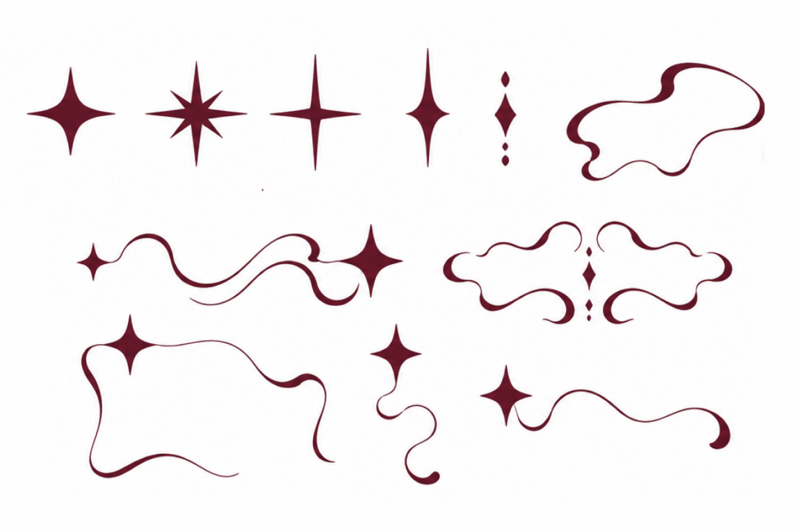
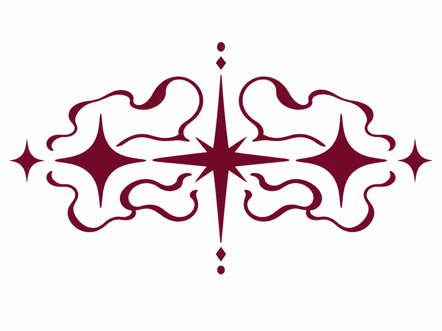
Промт:Create a neat, symmetrical, ornamental graphic element.
An elegant horizontal composition featuring a central star with long white rays, surrounded by four-pointed, octagonal-style stars. On either side, incorporate smooth, irregular, organic lines accompanied by flowing waves; these should be symmetrical on both sides, extending outward from the central star. Place small diamonds and circles above the central star and below the main structure. Colors: #710C2B on a pure white background. Use flat, solid colors—no gradients, textures, or shadows.
No text, no additional decorative elements, and no 3D effects.Промт:Using my graphic element, create small compositions for the brand identity. These should consist of individual flowing strips and stars, all designed in the style of the main element.
Градиенты
Промт:Create three vertical rectangles with smooth, grainy gradients on a white background. The rectangles should have slightly rounded corners, be identical in size, and be positioned side by side.
For the gradients, use my color palette: muted pink A66375, burgundy C2E5F2, and light gray F2F2F2.
In the first gradient, create a smooth transition from light blue at the top to muted pink and burgundy toward the bottom. The colors should blend unevenly, forming soft, wave-like transitions.
In the second gradient, use burgundy at the top, gradually transitioning into muted pink and light blue toward the bottom. The transitions should be blurred, with no sharp edges.
In the third gradient, use dark blue as the primary color, with light blue forming a smooth, blurred wave that runs through the entire composition in an S-shape.
Apply a fine, grainy texture—resembling film grain—to all the gradients. The colors should flow softly into one another, creating an atmosphere of a gentle glow and a light haze.The style should be minimalist and abstract; high quality, clean white background, with no text, shadows, or additional elements
Макеты
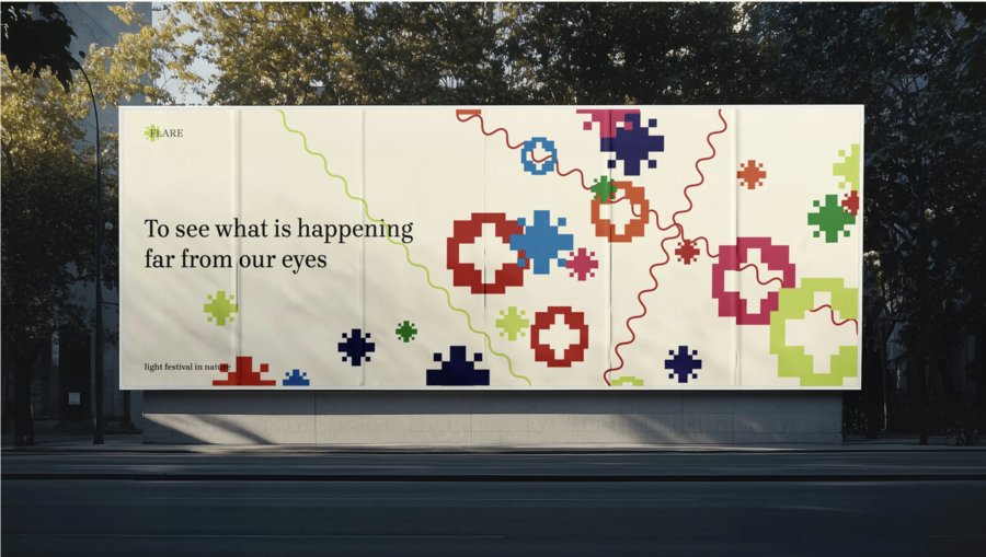
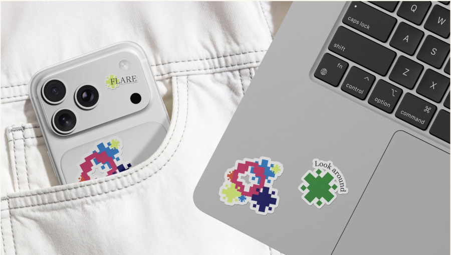
Для их генерации я использовала Chat GPT и Claude AI
Промт:Create a realistic, horizontal advertising billboard mockup for the FLARE light festival, mounted on a light-colored concrete wall. The poster itself features a solid, deep burgundy-raspberry background 30E33 with a very subtle, grainy texture. In the top-left corner, place the name «FLARE,» with «light festival» positioned below it. In the top-right corner, include a short, multi-line block of text: «people,» «light,» «nature,» and «temporary constellation.» The primary graphic element—a large, symmetrical symbol—should be centered on the poster; it consists of three elongated stars with slightly irregular, fluid edges, with the central star being the largest and the two flanking stars slightly smaller. Thin, winding lines weave around these stars, forming a symmetrical ornamental pattern. Use a light blue color C2E5F2 for all graphic elements and text. In the bottom-left corner, display the date and venue, and in the bottom-right corner, add a small, thin horizontal line. Use only the fonts «PP Neue Montreal Book» and «Inter Light.» The mockup should be set on the facade of a modern building constructed from large concrete panels with narrow joints. The billboard is encased in a dark metal frame. The scene is illuminated by warm daylight, with soft shadows cast by foliage falling across the wall and part of the poster. The camera angle is nearly frontal, with a slight perspective shift. At the base, a neat urban sidewalk and a few minimalist street elements are visible.