Every story has something to show
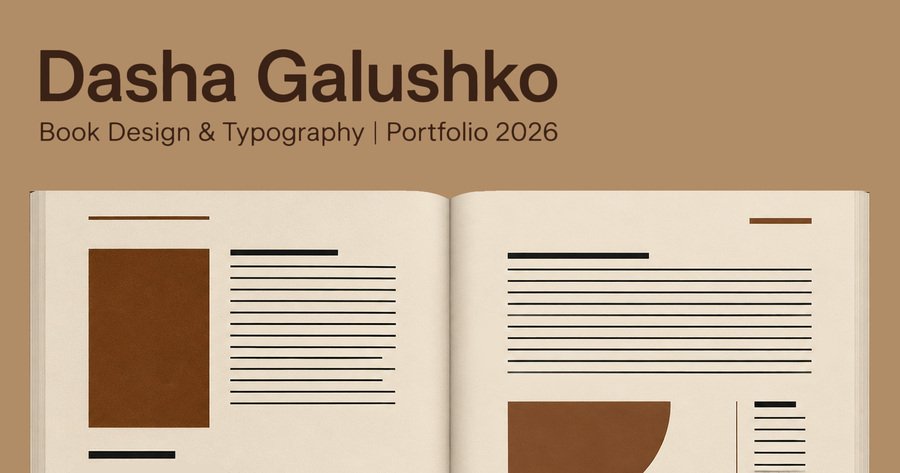
Book Design & Typography
My name is Dasha, and I’m a student at the HSE Art and Design School
I work across the whole book-design process, from the cover to the complete layout. I’m drawn to structure, precision, and the small typographic decisions that make a book engaging to read.My approach starts with the story. I want the visual language to support its meaning and atmosphere, highlighting what matters without becoming the main character. Whether a project grows from a novel I’ve read or a subject I’ve been exploring for months, I look for the form that belongs to that particular book.I’m open to new projects and collaborations.
Contact meWhat I offer
01. Cover design
A visual entry point that reflects the character of the book.02. Typography
A system that creates rhythm, hierarchy, and a comfortable reading experience.03. Book layout
A complete structure that brings text, images, and content together.04. Print-ready files
Fully done files that are ready to printMy projects
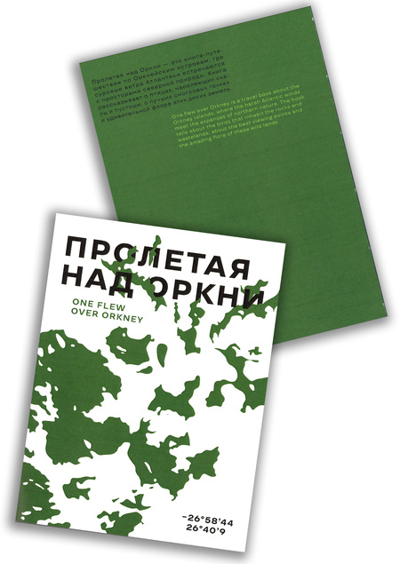
One Flew Over Orkney
Travel book design
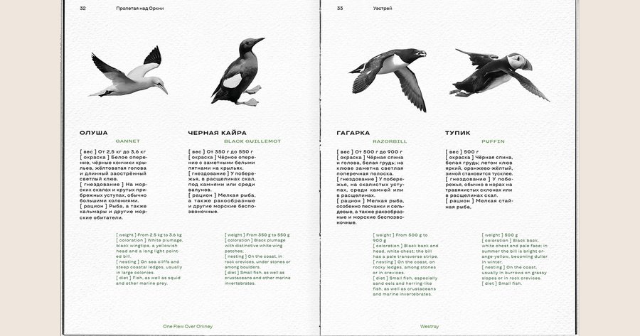
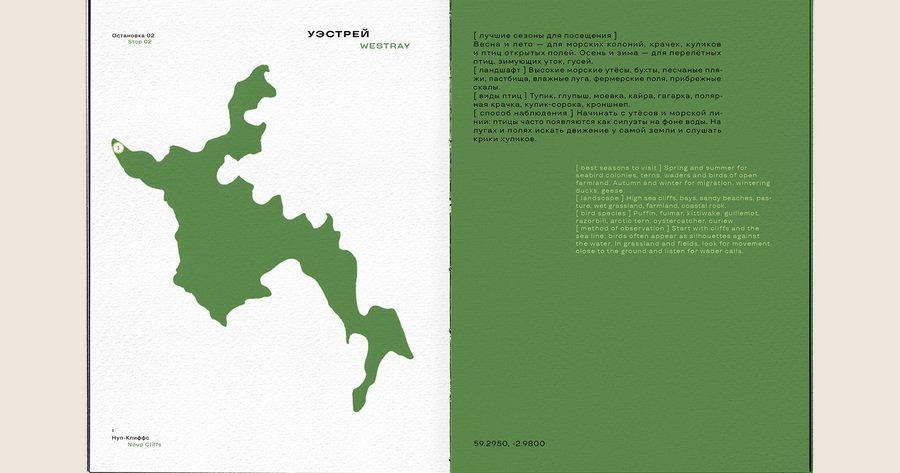
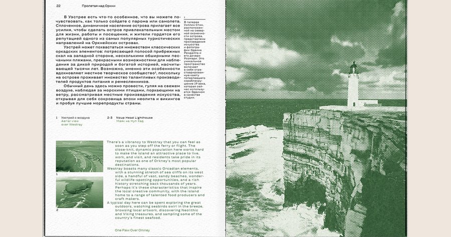
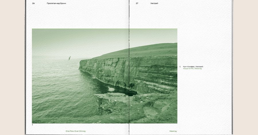
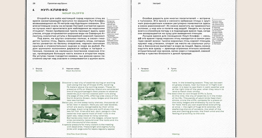
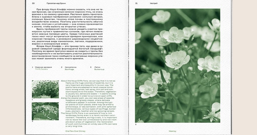
«One Flew Over Orkney» is a travel book about the Orkney Islands, where the strong winds of the Atlantic meet vast northern landscapes. The book explores the birds living among the cliffs and moors, the best viewpoints, and the unique flora of these remote islands.I developed the visual concept, designed the cover, created the typographic system, and worked on the complete book layout.160 × 210 mm; 120 pagesThe aim was to create a complete book design that would convey the atmosphere of the Orkney Islands and bring together different types of content: travel descriptions, information about wildlife, landscapes, viewpoints, and plants.
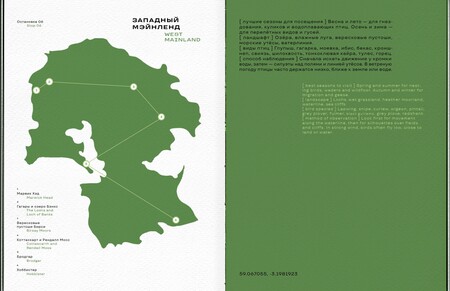
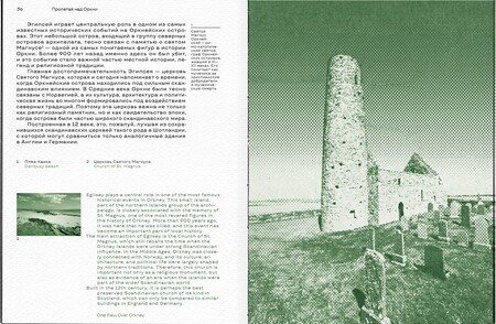
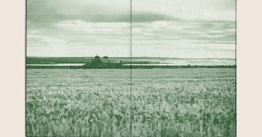
The visual language grows from the character of the place itself. Typography, image placement, and page rhythm work together to guide the reader through the landscape and make them feel the nature.The result is the coherent bilingual editorial system that turns the book into a visual journey through the islands, allowing the reader to explore their landscape, wildlife, and atmosphere page by page.
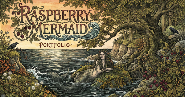
The Lower Depths
Play by Maxim Gorky
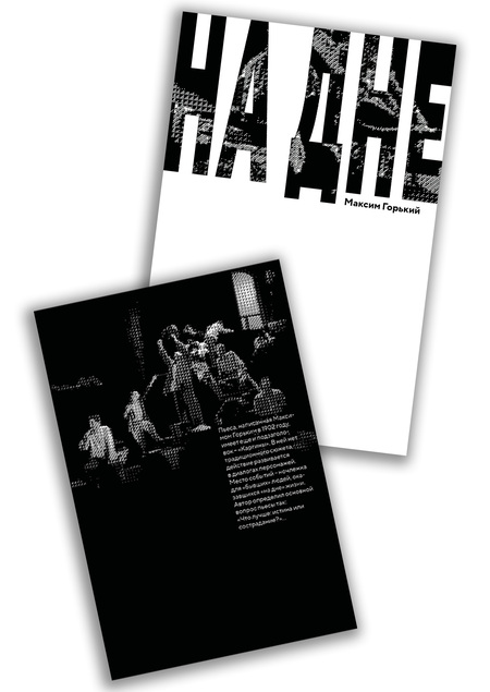
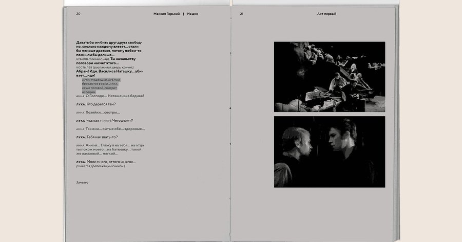
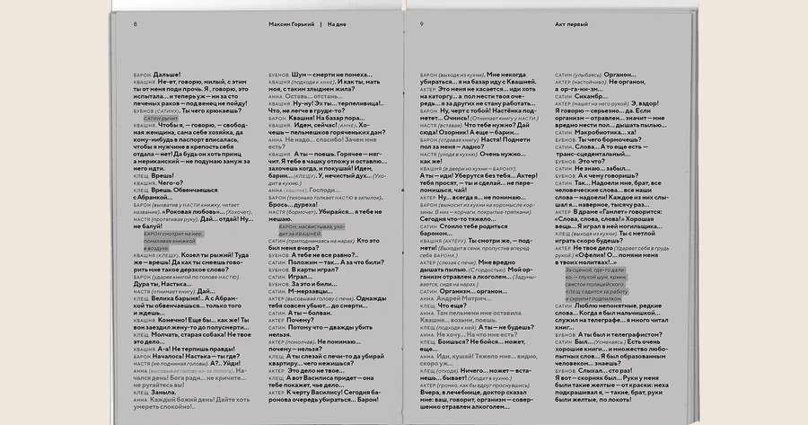
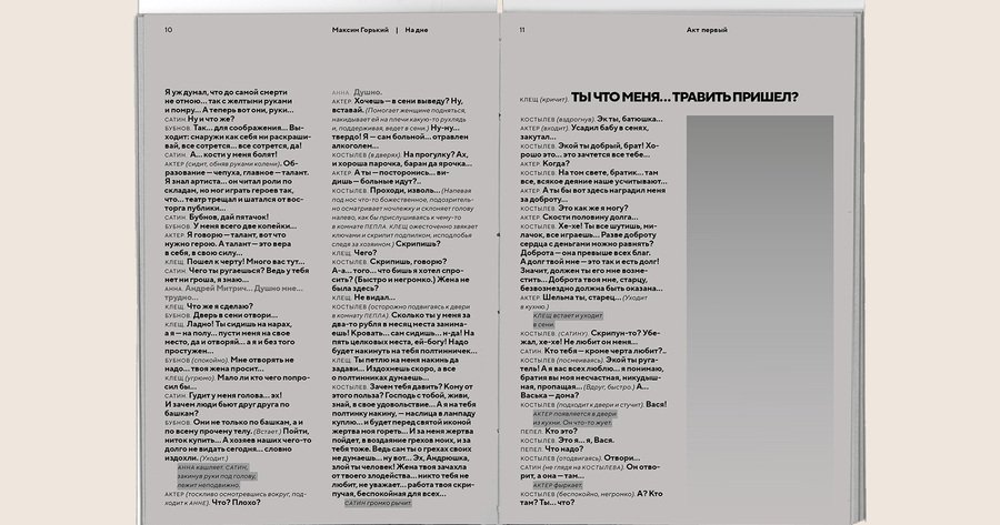
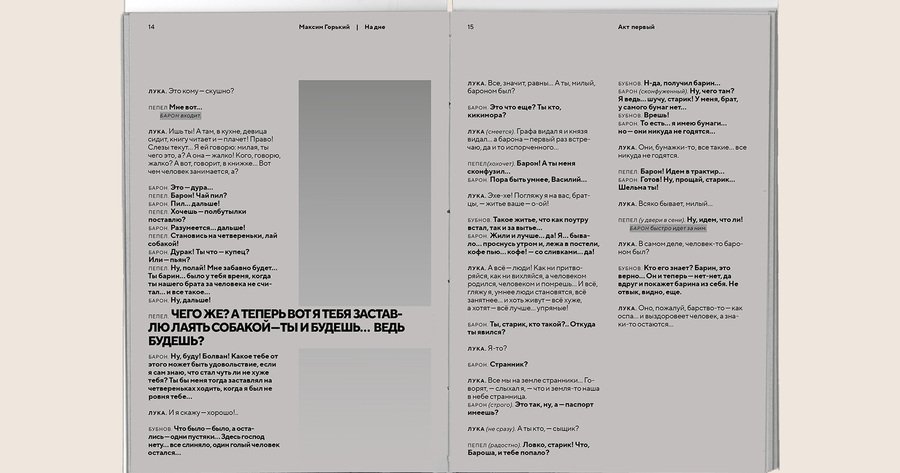
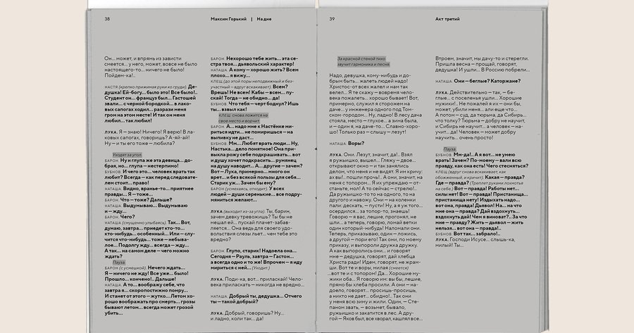
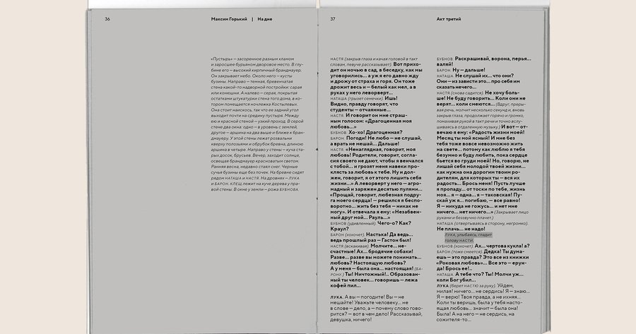
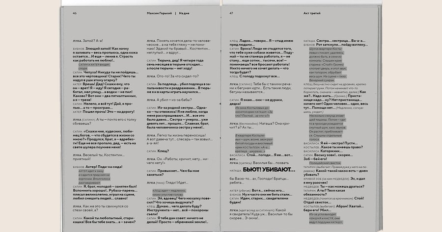
Written by Maxim Gorky in 1902, «The Lower Depths» takes place in a shelter for people who have found themselves on the margins of society. The play does not follow a traditional plot. Instead, its drama unfolds through conversations between the characters.The central question of the play is: What is better — truth or compassion?I designed the cover, developed the typographic system, organised the hierarchy of the dialogue, edited the images and created the complete book layout.140 × 203 mm; 64 pagesThe task was to design a typographic edition of the play and make the structure of the dialogue clear and easy to follow.
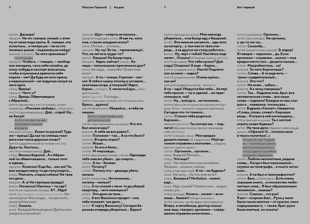
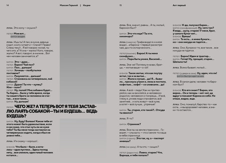
Since dialogue is the main form of action in the play, typography becomes an important part of its visual rhythm. The layout enhases the voices of the characters, establishes a clear hierarchy, and creates pauses between fragments of conversation.The result is the restrained typographic edition in which the structure of the page supports the dramatic structure of the play and makes the reading experience more focused and coherent.
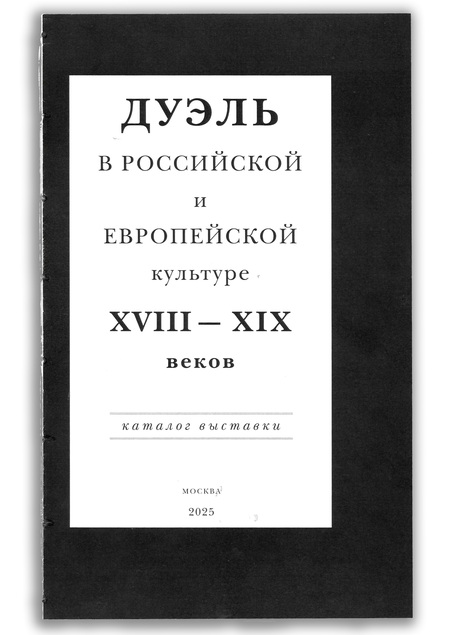
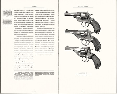
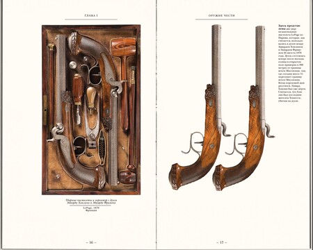
The Duel in Russian and European Culture of the 18th and 19th Centuries
Exhibition catalogue
The duel was an important cultural code that shaped European and Russian ideas of honour, personal dignity, justice, and individual freedom. For almost two centuries, it influenced the way aristocratic society understood a person’s right to decide not only their own fate, but also their life and death.This catalogue presents a complex and often contradictory phenomenon from several perspectives.I worked on the editorial concept, typographic system, grid, information hierarchy, image and text composition, and complete catalogue layout.180 × 295 mm; 64 pagesThe challenge was to organise historical and cultural material into a clear editorial structure while preserving the tension and drama of the subject.