Navigation
I. Introduction II. From Decorative Value to Emotional Impact III. The Renaissance: Michelangelo and Titian IV. Baroque: Caravaggio and Rembrandt V. Romanticism: Eugène Delacroix and Théodore Géricault VI. Impressionism: Monet and Renoir. Color as a Means of Perceiving Light and Emotion. VII. Post-Impressionism: Van Gogh. The Use of Color to Convey Inner States. VIII. Conclusion
I. Introduction.
Through my visual exploration, «Color as Emotion: From Titian to Van Gogh, ” I aim to trace the transformation of color perception in art. I will examine how the human eye interprets various colors in paintings and how color helps establish the mood of a piece.
Beginning with the Renaissance through Post-Impressionism.
Previously, color in artwork was used primarily to draw attention. Thus, in earlier forms of art, color served purely decorative purposes and lacked deep semantic weight. As we delve into the Renaissance era, starting with the works of Michelangelo and Titian—where color was employed to create depth and symbolism—we observe how artists gradually moved away from traditional meanings toward emotive expression. Artists masterfully used color to convey emotion, yet their approaches and styles differed. Michelangelo sought to keep the viewer’s focus on form and structure, while Titian explored emotional depth through colorism.
In Baroque works, artists like Caravaggio and Rembrandt used color as a means to convey dynamism and passion. Caravaggio created powerful contrasts between light and shadow, which amplified the emotional intensity of his pieces. While Rembrandt also had a masterful command of light and color, his works reveal a different approach. Rembrandt aimed to communicate more intimate and subtle emotions. Artists began using color to convey deep feeling, to create atmosphere by transmitting delicate and nuanced emotions. The influence of Caravaggio and Rembrandt on the Baroque can be described as a transformation of artistic language, where color became an integral part of the work’s emotional weight.
Diving into Romanticism and the works of Eugène Delacroix and Théodore Géricault, we notice entirely different approaches. Delacroix emphasizes the significance of color in conveying emotion in his letters. He argues that color can evoke strong feelings in the viewer and utilized it to create dramatic effects in his work. Théodore Géricault is known for his powerful depictions of nature and human struggle.
Impressionists like Claude Monet and Renoir began using color to depict light and the sensory experience of nature. Claude Monet paid particular attention to light and its reflections in nature. He utilized color as a means to convey the perception of the surrounding world, creating works that capture the atmosphere and the time of day.
Post-Impressionism, represented by masters such as Van Gogh, elevates the use of color to the level of personal emotional states.
Thus, color undergoes an evolution—from a symbol and a decorative element to a purely emotional experience—reflecting shifts in artistic perception and cultural context.
II. The Shift from Decorative Value to Emotional Impact.
Color was previously used to attract attention.
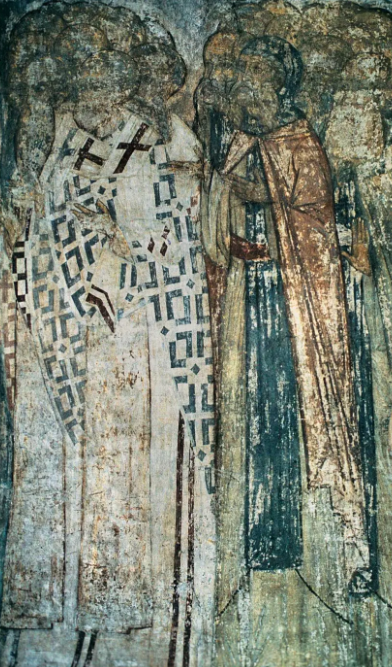
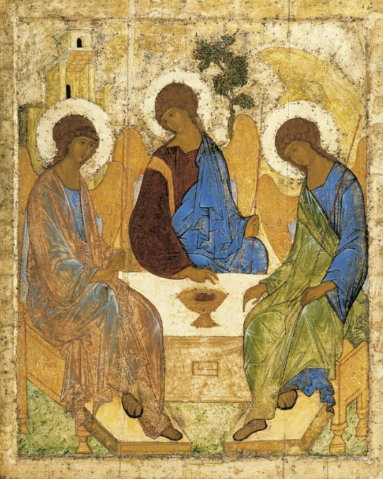
Andrei Rublev. The Last Judgment: Faces of Righteous Men (1408) Andrei Rublev. The Trinity (1411)
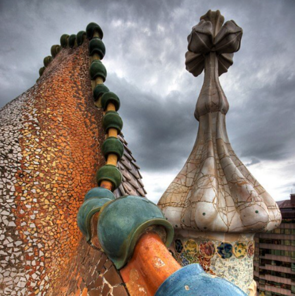
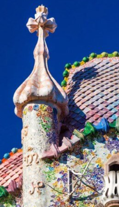
Antoni Gaudí. Casa Batlló (1904)
In early art forms, such as iconography and mosaic, color was often employed for decorative purposes. It served to create patterns—specifically to draw attention to compositional elements—but did not always carry deep emotional weight.
Color is a language through which artists can convey their emotions, cultural and religious symbols, and create a powerful visual impact.
Whenever we look at any image, our brain reads color as information—for example, blue can evoke a feeling of calm and tranquility. Therefore, color is one of the key elements of art that significantly influences the viewer’s perception and emotional state. In a historical context, the use of color to convey feelings varied depending on the styles, cultures, and artistic movements.
III. The Renaissance: Michelangelo and Titian.
Color began to play a more significant role in conveying mood and feeling. The study of sensuality and color contrast.
Michelangelo. The Depth of the Human and the Divine.
The Creation of Adam. Michelangelo Buonarroti (1475–1564)
Michelangelo used the sky and flesh tones to convey intense feelings and emotions, crafting the concept of divine creation. The warm skin tones of both Adam and God highlight them as central figures, emphasizing Adam’s humanity and God’s divinity. The contrast between the warm skin colors and the cool backgrounds underscores the distinction between humankind and the divine. Michelangelo skillfully employs various shades to establish mood. For instance, the use of vibrant, saturated colors on God’s figure contrasts with the softer, calmer tones of Adam, which emphasizes his vulnerability.
Crucifixion of Saint Peter. Michelangelo Buonarroti (1475–1564)
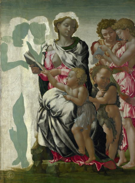
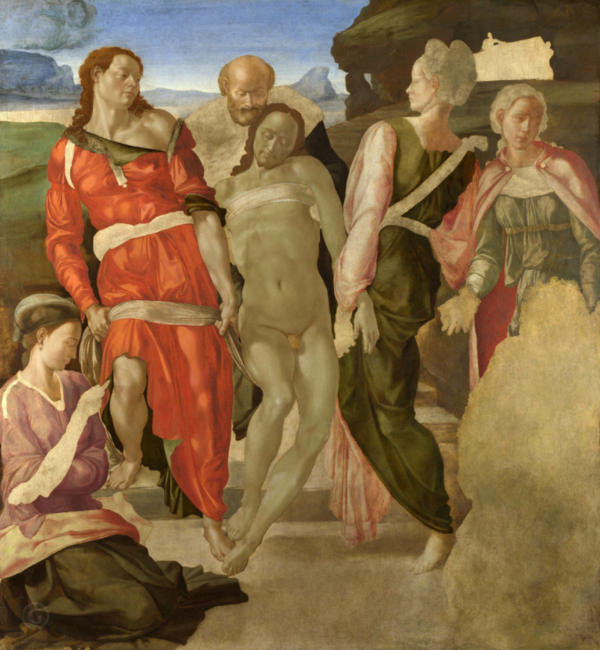
Manchester Madonna. Michelangelo Buonarroti (1497) Disposition in a Sarcophagus. Michelangelo Buonarroti (1475–1564)
This was a revolutionary step, as artists had previously used color exclusively as a decorative element.
Michelangelo sought to depict not only the external appeal but also the inner power, passion, and drama of the human spirit. His artwork, even in states of repose, is brimming with a boiling energy that reflects struggle, suffering, rapture, or deep meditation. This demonstrates his Renaissance view of humankind as the pinnacle of creation—a being endowed with a unique capacity for creativity and self-perfection, yet simultaneously bound by the fragility of life.
The Last Judgment. Michelangelo Buonarroti (1475–1564)
Michelangelo paid special attention to color. For instance, in «The Last Judgment,» he uses the contrast between blue and white to highlight figures and create depth. This helps to draw attention to the key characters and events while also lending the painting dynamism and tension.
Michelangelo’s particular focus on white and blue color
Michelangelo, like many other Renaissance artists, paid particular attention to color because it was an important tool for conveying emotion, mood, and symbolism in art.
White could be used to emphasize a divine quality, especially in depictions of saints and spiritual subjects.
In medieval and Renaissance art, blue often symbolized the heavenly, the eternal, and the divine. In his works, blue could be employed to create contrast with other colors and to highlight specific elements of the composition.
Titian and the harmonious interplay of color.
His technique of «colorism» was distinguished by vibrant, rich hues and his skillful blending of them, lending depth and volume to his works.
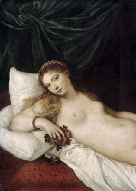
Titian frequently employed color to highlight primary figures and establish contrast, as well as to convey light and shadow. His works, such as «Venus of Urbino, ” demonstrate mastery in utilizing color gradients and subtle transitions, which makes his paintings alive and expressive.
Venus by Urbinskaya. Titian Vecellio (1490–1576)
For example, in this painting. Titian utilized warm skin tones and soft, delicate background shades to convey emotion and create depth, establishing an atmosphere of tenderness and sensuality. The play of light and shadow helps build volume and depth, intensifying the emotional impact. The lighter areas on Venus’s skin lend softness and warmth to the figure, while the darker backgrounds accentuate the form.
Titian uses a harmonious color combination that establishes a visual sequence and draws the viewer’s gaze toward the central figure. For instance, the green hues behind Venus emphasize her beauty and connection to nature.
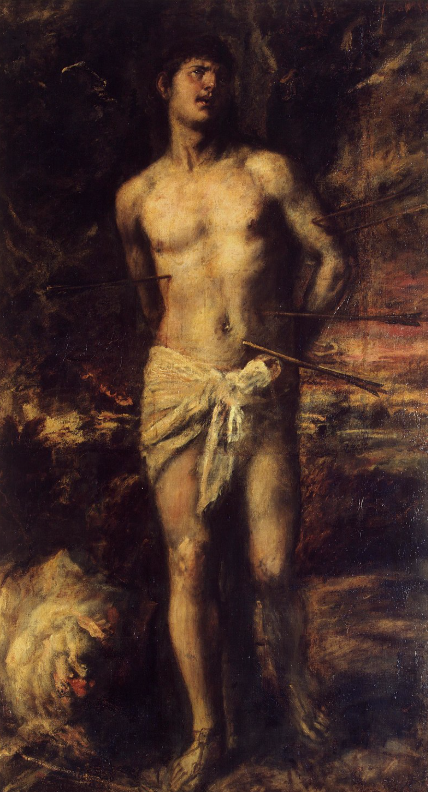
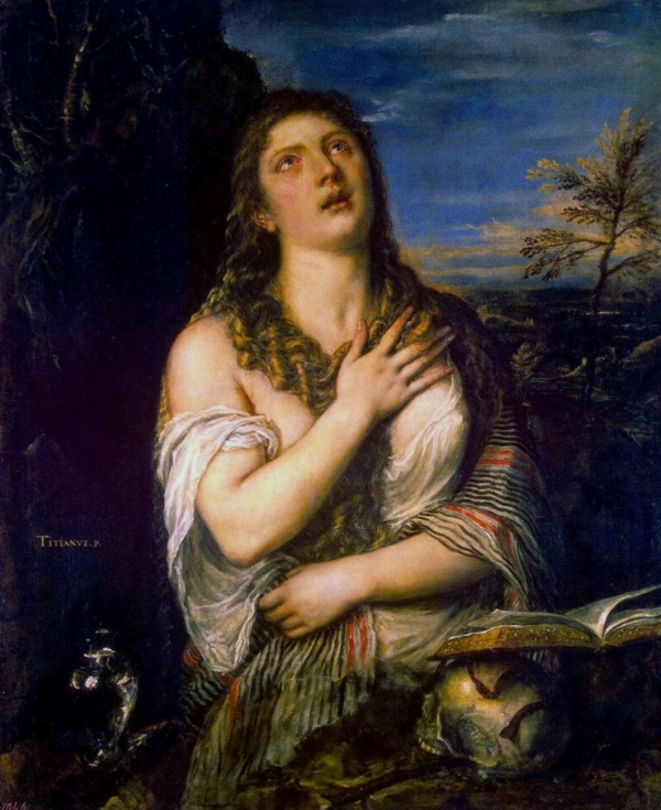
St. Sebastian. Titian Vecelliio (1576) The Penitential Mary Magdalene. Titian Vecelliio (1565)