Communication theory: glaze&glory

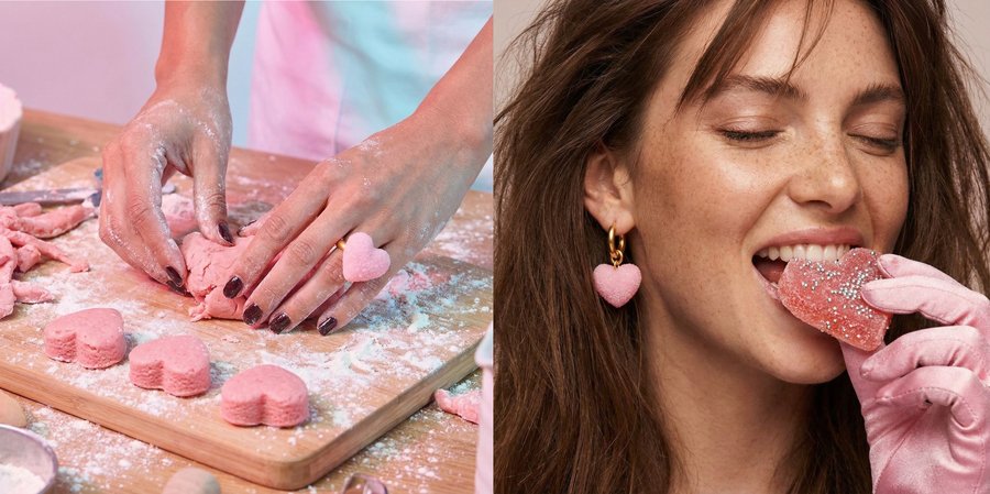
Brand uses communication theory to build meaning through symbols and signs. Jewelry is presented as a thing that visually merges with dessert forms and aligns brand with a semiotic tradition. The message is understood quickly through sensory signs: textures, glossiness.

In design, communication theory helps explain how objects can speak through form, color, and material long before any text appears. Designers often work with visual rhetoric, arranging elements and choosing colors in ways that guide perception and emotion. Meaning is also created through signs, as the semiotic tradition suggests, because viewers read shapes and textures as symbolic cues that connect to their own experiences.
These ideas become especially visible in glaze & glory, where jewelry is intentionally crafted to trigger associations with sweets. The soft, glossy surfaces act as peripheral cues in the Elaboration Likelihood Model: people respond emotionally first, without cognitive effort. By relying on intuitive, sensory communication rather than detailed explanation, the brand shows how design can function as a persuasive message. It demonstrates that in contemporary design practice, communication is not only about storytelling in words, but about shaping experiences that allow audiences to «read» the object through feeling and memory.

What is glaze & glory? glaze & glory is a jewelry brand inspired by the aesthetics and sensations of sweets. Not literal replicas, but carefully translated forms, textures, and colors that evoke sugar, candy, and small childhood pleasures.
These are pieces that look as if they could be tasted soft shapes, glossy surfaces, pastel tones transforming edible memories into wearable objects.
The brand materializes nostalgia, turning the feeling of sweetness into a visual and tactile experience. glaze & glory exists at the intersection of emotion, memory, and design where jewelry becomes a reminder that joy can remain light, playful, and intimate even in adulthood.
Key visual The key visual language is built around jewelry that resembles sweets. Rings, earrings, and pendants visually echo candy shapes: gummy hearts, sugar-coated surfaces, lollipops, and jelly textures. Materials appear glossy, translucent, and softly reflective, creating the illusion of edible objects while remaining clearly precious.
Visual accents reference candy packaging, playful doodles, and gentle movement, reinforcing the feeling of lightness and desire. The result is a visual system that feels: sweet but refined, playful yet intentional, nostalgic without being childish.
Target audience and key message Target audience: Girls and women aged 15–35 who are emotionally driven, visually sensitive, and value personal meaning in objects. They appreciate design with character, enjoy nostalgia, and often choose jewelry as an emotional purchase for themselves or as a gift.
Key message: «Jewelry with the taste of childhood.» Communication goal: To shift the perception of jewelry from a decorative accessory to an emotional object one that carries memories, sensations, and personal associations.
Theoretical framework: how we communicate The brand communicates primarily through the peripheral route of the Elaboration Likelihood Model (ELM), addressing emotions rather than rational arguments.
Instead of focusing on materials or technical characteristics, communication relies on: Sensory appeal: sugar-like textures, glossy finishes, candy-inspired colors. Emotional cues: nostalgia, warmth, and playful pleasure. Associative thinking: visual resemblance to sweets triggers memory and desire instantly.
The jewelry is understood intuitively through feeling before thought.
Brand values and community glaze & glory is built on three core values: 1. Nostalgia Each piece recalls small, happy moments, candies bought on the way home, shared sweets, unexpected treats. 2. Playfulness The brand embraces softness, joy, and visual humor as a conscious aesthetic choice. 3. Emotional connection Jewelry becomes personal: not just worn, but remembered, gifted, and emotionally owned. Together, these values create a brand that people relate to, not just consume.
Promotion strategy and engagement mechanics Communication channels: 1. Website The central brand space where storytelling, collections, and visual identity come together. The site works as an immersive environment rather than a traditional catalog.
2. Social media (Telegram, TikTok) Used for visual storytelling, emotional mood-building, behind-the-scenes content, and short-form video.
3. Marketplaces and Gold Apple Jewelry is available on selected marketplaces, ensuring accessibility and ease of purchase while maintaining strong visual branding.
Offline activation: pop-up experience The brand extends beyond digital platforms through pop-up stores. Pop-ups are designed as playful, candy-inspired spaces where jewelry is displayed like sweets in a store window. Visitors interact with the brand physically, reinforcing the tactile and emotional nature of the products.
As part of offline promotion, the brand distributes real sweets on the street, packaged in signature branded bags. This gesture works as a direct sensory trigger taste and touch inviting people into the brand’s world before they even see the jewelry.
The experience creates instant emotional engagement and transforms first contact into a memorable moment.
Final communication principle glaze & glory does not sell jewelry alone. It sells a feeling — the sweetness of memory, translated into form. Through visual resemblance to sweets, emotional storytelling, and playful physical interaction, the brand builds a space where adulthood and childhood meet lightly, softly, and with pleasure.
Deep dive into design: three layers of communication The brand is designed as a multi-layered communication system in which jewelry functions not only as an aesthetic object, but as a medium of meaning, experience, and social interaction. Each design decision operates simultaneously on semiotic, phenomenological, and social levels.
1. Semiotic layer («Sign»): Materials and form as a system of meaning At the semiotic level, materials, colors, and forms operate as signs that reference sweets and childhood memories through abstraction rather than literal depiction.
Materials as signs Glass and crystal (transparent and semi-transparent) These materials resemble sugar, candy glaze, and jelly textures. They function as signs of fragility, sweetness, and emotional openness, evoking the visual language of confectionery while remaining within the domain of jewelry. Rose quartz and sugar-like quartz soft, powdered surfaces and pastel tones reference tenderness, care, and nostalgia. These materials act as emotional signifiers rather than decorative elements. Metals (silver, brass, steel, aluminum) Polished metals introduce structure and durability. Their role is to balance sweetness with adulthood, transforming playful references into refined, wearable objects. Together, the material system creates a dialogue between softness and precision between childhood associations and adult design logic.
Color system as a non-verbal signal The brand uses a restrained pink and blue color palette, avoiding aggressive contrasts or complex gradients. Pink signifies warmth, care, emotional closeness, and sweetness. Blue represents calmness, trust, balance, and clarity. This limited palette functions as a non-verbal positioning tool, clearly communicating the brand’s identity as playful yet refined, emotional yet controlled.
2. Phenomenological layer («Experience»): sensory dialogue with jewelry At the phenomenological level, the focus shifts from what jewelry represents to how it is perceived and experienced.
Tactile and visual experience Rounded forms encourage touch and create a sense of softness. Glossy and translucent surfaces visually suggest tactility, activating sensory memory even before physical contact. The jewelry appears almost edible, triggering associations with taste, texture, and pleasure through sight alone.
Embodied and emotional cognition The experience of interacting with the jewelry is intuitive and emotional rather than analytical. Meaning emerges through: visual recognition of familiar sweet-like forms, tactile imagination, emotional recall of childhood moments. The design facilitates a quiet, personal dialogue between the object and the wearer, where memory and sensation become part of the experience.
3. Social layer («Interaction»): jewelry as a trigger for social practices At the social level, jewelry is conceived as a divisible cultural unit an object that naturally integrates into social behavior.
The design supports and encourages specific practices: Photography and visual content creation, due to the jewelry’s strong aesthetic identity. Sharing, both digitally (social media) and physically (gifting). Collecting, where pieces accumulate personal meaning over time. Offline interaction, especially through pop-up spaces and street activations. Through these practices, jewelry becomes part of social exchange rather than a purely individual possession.
Theoretical frameworks in action Structure and agency The project applies Anthony Giddens’ structuration theory to explain how meaning is produced through the interaction between design structure and user agency. 1. The brand as a structure The brand establishes a system of rules and resources: sweet-inspired visual codes, material limitations, a stable pink-and-blue color language, aesthetic boundaries that avoid literal imitation. This structure frames interpretation and ensures recognizability.
2. The user as an agent The wearer exercises agency by choosing, styling, wearing, and gifting jewelry. Through these actions, users actively assign meaning and embed the objects into their personal narratives.
3. Dialectics of reproduction and transformation By wearing the jewelry, users reproduce the brand’s core meanings sweetness, nostalgia, emotional warmth while transforming them into individual experiences. The brand remains stable, yet continuously redefined through use.
Professional challenge: balancing precision and freedom A key design challenge was balancing emotional clarity with creative abstraction. 1. The challenge To reference sweets and childhood memories clearly enough to trigger recognition, while avoiding literal forms that could reduce the jewelry to novelty objects.
2. Design solution The solution was achieved through abstraction: texture instead of realism, color instead of illustration, form suggestion instead of direct representation. Material and production constraints were reframed as communicative tools that support emotional meaning while preserving refinement and wearability.
Value proposition for professionals: theory as a design tool The project demonstrates a shift toward theory driven design, where communication theory actively informs form, material, and interaction.
The design process integrates: Semiotics — jewelry elements function as signs of sweetness and memory. Phenomenology — meaning emerges through sensory and emotional experience. Symbolic interactionism — objects acquire meaning through social use and exchange. Identity construction — jewelry supports emotional self-identification and personal storytelling. In this framework, jewelry becomes more than an accessory. It functions as a medium of emotional communication, translating childhood joy into a wearable, socially meaningful form.
Communication theory helps shaping presentations not only on a visual level, but in the way information is selected, structured, and delivered. Classical rhetoric reminds us how to combines logic, credibility, and emotion, so an effective presentation balances facts with a clear narrative that speaks to the audience’s preferences. The semiotic approach shows that every example, image, or concept used in a presentation works as a sign that guides meaning-making. And according to the Elaboration Likelihood Model (ELM), presenters must understand if the audience will process information through rational thinking or through quick emotional signs, which affects how much detail to include and how to frame the message.
In the glaze & glory project, these principles shape both content and delivery. The presentation does not just list design features; it builds a story around memory, emotion, and sensory experience, helping the audience to understand why the jewelry matters, not only how it looks. Descriptions of materials, user experience, and brand values act as symbols that create meaning, while imagery and emotional vocabulary support the presentation. As a result, the presentation communicates the concept as a complete system: a design idea, a feeling, and a brand identity, showing how theory-based structuring makes the message clearer, easier to understand, and more memorable.
The project is based on materials from the Communication Theory course.
glaze& glory // HSEDESIGN URL: https://hsedesign.ru/project/0b9fb3b4b07948e292d8585c6b334e8c (Просмотрено: 08.12.2025)
glaze& glory // HSEPORTFOLIO URL: https://portfolio.hse.ru/Project/255780 (Просмотрено: 08.12.2025)


