How Communication Theory Works in the Field of Design and Contemporary Digital Products
In contemporary design, communication is understood as a process of meaning-making rather than the simple transfer of information. Within the framework of the course Communication Theory: Bridging Academia and Practice, design functions as an interpretive practice in which meaning emerges through the interaction of an artifact, its user, and the socio-cultural context.
The project «There Is a Place» (translated from Russian «Есть Место») follows this interpretive approach.
It presents travel as a communicative experience in which places are mediated through narrative, interface, and visual language. Information about locations is not treated as objective knowledge, but as a flexible story that users engage with on their own terms. In this way, travel becomes a space for emotional involvement and identity construction.
From the perspective of encoding and decoding, the project communicates through accessible language, a friendly tone of voice, and a clear interface structure. These elements function as communicative codes that contrast with the formal and authoritative discourse of traditional guides. As a result, users interpret the content as a personal recommendation rather than an institutional explanation.
Within uncertainty reduction theory, communication helps individuals feel more comfortable in unfamiliar environments. There Is a Place supports this function by offering curated narratives and structured routes that make new places easier to navigate without overwhelming the user with information.
The project can also be examined from a socio-cultural perspective. By encouraging independent exploration and personalized routes, There Is a Place contributes to a shared understanding of domestic travel as a meaningful cultural practice. It shifts attention from standardized tourist paths to personal experience and reflection.
In terms of identity communication, the project enables users to express themselves through saved routes, collected memories, and shared content. These practices allow private experiences to enter public communication, especially within social media.
From the viewpoint of social exchange theory, the project offers rewards that outweigh its costs. Users gain emotional value such as confidence, inspiration, and social recognition, while avoiding the financial, temporal, and social constraints of traditional excursions. This balance explains sustained engagement with the product.
Overall, There Is a Place demonstrates how communication theory can serve as a foundation for digital design. The project shows how meaning, identity, and engagement can be produced through carefully structured communicative practices rather than through the accumulation of information.
Presentation of the project for a general audience
There Is a Place is a friendly, self-paced travel guide to Russia’s must-see spots, turning overwhelming information into clear stories, audio routes, and shareable memories.
It helps you choose where to go, understand what makes a place special, and explore it in a way that feels easy, flexible, and truly yours.
Slogan: There Is a Place is your personal guide to the main places of Russia
We created There Is a Place for people who want to travel more without group excursions, strict schedules, or boring guides. If you are curious about places and their stories and prefer to explore at your own pace, this project is for you.
With There Is a Place, you decide how your trip unfolds. Listen to audio guides while walking, read short stories when you want, save favorite spots, and build your own route. No rushing, no overload, no pressure to see everything.
The project helps you feel confident in unfamiliar places. Clear navigation, simple language, and carefully chosen stories help you understand where you are, what matters, and why it is worth your attention.
There Is a Place is also about sharing. You can save memories, collect visited places, and show them to friends. Travel becomes part of your personal story and the way you express who you are.
Our communication is friendly and human. We speak like someone who knows a great place and wants to share it. Visuals, short texts, and engaging audio help you feel connected even before you arrive.
In simple terms, There Is a Place gives you more freedom and emotion with less effort.
Less planning, more discovery.
Not ticking off landmarks, but creating a travel experience that feels personal and memorable.
Presentation of the project for a professional audience
For a professional audience, There Is a Place can be understood as a communication-driven digital product that operates at the intersection of design, narrative, and identity construction.
The project is built on an interpretive communication paradigm, where visual language, interface design, and tone of voice function as tools for meaning-making rather than neutral carriers of information.
Interaction and identity
Interaction design plays a central role in communication with the professional audience. Features such as saving routes, collecting memories, and sharing experiences turn the user into an active participant in the communicative process.
The application becomes a platform for identity performance, where travel choices and saved content function as markers of lifestyle and personal values.
Within a socio-cultural framework, There Is a Place establishes a new norm of domestic travel that is slow, reflective, and personalized. The design supports this norm by encouraging selective engagement rather than total consumption of content.
Target audience
The core audience consists of young adults interested in independent travel, cultural exploration, and personalized experiences.
These users value autonomy, emotional engagement, and clarity over exhaustive information.


From a communication perspective, the audience demonstrates low tolerance for authoritative discourse and high sensitivity to tone, aesthetics, and usability.
This directly informs both content structure and visual decisions within the project.
Design concept
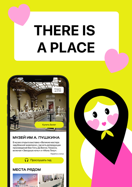
The design of There Is a Place is based on the idea of a personal guide rather than an institutional one. This is expressed through a visual system with bright accents, generous spacing, and modular content, avoiding traditional museum or tourism aesthetics to ensure clarity and emotional accessibility.
The color palette plays a key communicative role. Black, white, and light gray create a neutral, readable base, while bright accents guide attention. Yellow acts as the main emotional and functional accent, highlighting key actions and navigation. Pink and soft pastel tones add warmth and friendliness, balancing the intensity of yellow.
From a semiotic perspective, the palette communicates openness, curiosity, and accessibility. It moves the project away from traditional «serious» cultural aesthetics and presents historical and cultural content as engaging and easy to approach rather than academic.
The visual identity is built around a matryoshka-inspired mascot and logo. This culturally recognizable symbol is reinterpreted in a simplified, contemporary form to preserve meaning without folkloristic clichés.
The symbol also functions as a location marker. By combining the matryoshka with the logic of a map pin, the logo becomes both a sign of cultural identity and a tool of navigation, visually indicating places of interest in the interface and physical space.
The mascot’s soft shapes and friendly facial features support a warm and approachable tone of voice. Rather than acting as a character, it functions as a visual companion that helps orient the user and emotionally anchors the brand.



