Rubricator
1. How communication theory works in the field of design — Semiotics: meaning through signs — Visual rhetoric — UX and interaction design: communication through action — Cultural and social context — Narrative theory and media theory — Design is a controlled attempt to shape perception
2. The brand introduction for a general audience — CHOCOPLAN — Target audience — Naming & Logo
3. The brand introduction for a professional audience — Direct and indirect competitors — The Brand Pyramid — Tone and communication style — Channel integration principles — Content Formats
4. Communication theory as the basis for presentation — Visual rhetoric — Digital rhetoric — Elaboration Likelihood model — Narrative Paradigm — Two-way symmetrical model of PR
5. Bibliography and image sources
How communication theory works in the field of design
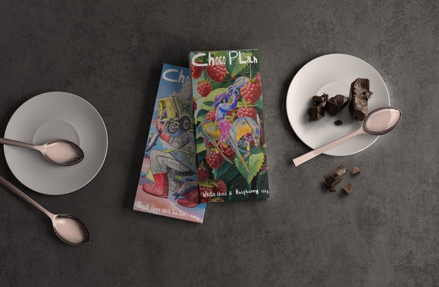
The visualization of ChocoPlan chocolate bars by Adeliya Chanysheva, 2025.
Communication could be defined as a relational process in which a sender delivers a message through a certain medium and receives feedback. A brand transmits values and ideas to a customer through visual design that turns abstract messages into tangible forms to achieve a response as a user’s behavior. Therefore, communication theory in the field of design explains the way meaning is created, transmitted, perceived, and interpreted through visual, verbal, and experiential forms. Designers rely on these principles to ensure that what they intend to communicate meets the audience’s understanding.
To explain elaboratively how communication theory works in the field of design, it is essential to take into consideration narrative theory, semiotics, visual rhetoric, interaction design, cultural and social context, media theory.
Meaning through signs. Generated with Gigachat
Semiotics: meaning through signs
Signs are used to communicate meaning and help to ensure that visuals trigger the intended interpretation across the audience. Imagery highlights the idea that is supposed to be delivered; for instance, the delete function is usually depicted as a trash bin icon, indexes show cause-effect (smoke leads to fire), and symbols are culturally learned (red is associated with danger).
Visual information is usually organized according to proximity (objects that are placed together are seen as related), similarity (matching shapes, sizes and colors create groups), figure-ground (separation of a visual scene into a main object and the area it rests on) and closure (filling in missing gaps to create a unified object). Listed principles help designers to create intuitive layouts and visual hierarchy to guide consumer’s attention.
Generated with Gigachat
Visual rhetoric
Design brings an opportunity to communicate emotions and arguments visually, which is crucial to enhance persuasion in such spheres as advertising and political messaging. By saying «The image is a message» [3], Barthes highlights the importance and power of visuals that are used strategically in campaigns and constructed brand identity. These principles were used within a wide range of ideologies to activate a response in the viewer.Composition navigates eye movement», certain shapes bring dynamic or static qualities depending on the goal to achieve. Kandinsky described a square as a steady object and a triangle as active and driving: «The triangle’s tension is directed, purposeful, and therefore compels the eye to move.»[4]Color communicates emotions and addresses the subconscious: blue associates with calmness, trust and reliability, so it is usually used in logos of social networks (Facebook, Twitter, VK). Red catches attention, creates urgency and provokes quick decisions and impulsive buys, usually mixed with yellow for feelings of nostalgia and happiness — this tendency can be observed in logos of fast-food companies such as McDonalds and KFC. Typography sets tone in a range from serious to playful.
Generated with Gigachat
UX and interaction design: communication through action
Design communicates through affordances and feedback that show success or failure. Implementation of animations, sounds, gifs, decorated writings and styled notifications gives feedback and provides immersiveness. As Norman said, «Design is really an act of communication, which means having a deep understanding of the person with whom the designer is communicating.» [1] Button shape and color communicate with a user and look clickable, sliders provoke drag, while layout and flow indicator priority and context. This approach is vital in video games, interactive longreads (Readymag), apps (google maps, Duolingo).
Cultural and social context
Cultural code the meaning of yellow color might be the opposite according to a local tradition: In India it symbolizes bliss and divinity, while in China it is more ambiguous and indicates betrayal and pornography. Along with geographical variations, generational differences play a role in perception and affect the way symbols are interpreted. One of the brightest examples is the discourse on the wide-smile open-eyed emoji between zoomers and millennials: the older generation tends to use it in a friendly way, while the younger decodes it as a passive-aggressive sign or uses it ironically.
Cultural differences between generations. Generated with Gigachat
Cultural and social context
Storytelling is a crucial part of design, narrative paradigm helps to create emotional bonds and involve users into communication that starts from the logo that summarizes the brand’s values and ends with packaging guiding the customer experience. For instance, Nike uses a narrative of personal triumph and unlocking personal potential. The brand’s story addresses the everyday person pushing themselves — it expands the targeted audience and provokes emotional response. As it was said by Barthes «Image is a message”[3], McLuhan continues saying „The medium is the message“ [2]- the medium shapes the message itself, alters user interpretation and behavior, therefore designers have to choose the most accurate one (interaction, motion, graphic) to highlight the intended idea.
Generated with Gigachat
Design is a controlled attempt to shape perception
Communication theory in the field of design ensures that the message is encoded correctly using semiotics and visual rhetoric, supported by the medium according to media theory, decoded easily by the audience, interpreted through culture according to social context, and delivers the intended meaning. Taking into consideration the listed principles, design could be named as a controlled attempt to shape and adjust meaning, perception and action.
The Brand introduction for a general audience
Communication through the packaging design by Adeliya Chanysheva, 2025.
«CHOCOPLAN»
Chocolate bars made from South American cocoa beans are produced with fillings that are inspired by local confectionery traditions. The cardboard packaging is illustrated with a combination of digital art and hand-drawn graphics. On the front side are people collecting ingredients for the filling. The background is other constituent filler: large juicy berries, waves of cream and salty lake. The plot of illustrations enhances the value of manual labor and the naturalness of the final product. Product range consists of three flavors: white chocolate with raspberry, dark chocolate with high cocoa content and salt and milk chocolate with cream Dulce de Leche.The The visualization of gathering the ingredients for ChocoPlan production. Generated with Gigachat
The Brand research by Adeliya Chanysheva, 2025.
Target audience
Individuals between the ages of 20 and 65 who are curious and seeking new flavors and natural compositions. Those who appreciate the cultures of other countries, in particular culinary and confectionery traditions. Those who are attracted by vivid illustrations and manual labor. Also the audience is characterized by an average and above-average income, people rely on emotions while making a decision of purchase.
The audience on the theme fair. Generated with Gigachat
Naming & Logo
Communication through logo symbols by Adeliya Chanysheva, 2025.
The Brand introduction for a professional audience
The visualization of ChocoPlan chocolate bars Adeliya Chanysheva, 2025.
Direct and indirect competitors
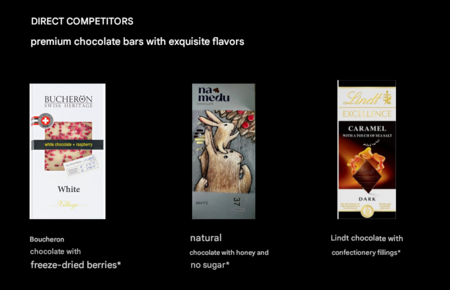
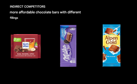
The analysis of brand’s competitors
ChocoPlan’s main competitors are premium chocolate brands. Their distinctive features — packaging made of dense cardboard or metal, natural composition and high-quality ingredients and inert fillers. Rarely among such products there are packaging with illustrations. The indirect competitors are preempting the nipple with cheaper raw materials and wrapping materials — mainly plastic, the design is vivid. Chocolate ChocoPlan stands out among its direct competitors due to the illustrative and bright packaging, among the indirect by its natural composition and stylistics.