About me
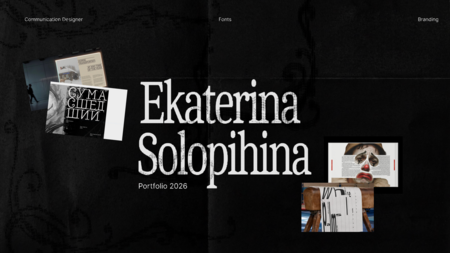
Polina Petrova | HSE Art and Design School | 4th-year student | Specialization in typography and brandingI am a graphic designer whose area of expertise includes branding and identity, type design, and the layout of multi-page publications. My main task and goal is to help the client build clear communication with their audience through an outstanding visual solution.My skills include: Identity logos, social media design, packaging, navigation systems, merch, printing. Publication layout books, catalogs, brochures, booklets. Type design typeface development. Additionally generative graphics, prepress preparation.
Table of contents
1. Brand Identity · koha | Maori jewerly brand · Packaging for koha · Navigation system for the Almazov National Medical Research Centre 2. Multi-page Publications · Anna Simons. Monograph · Galina Bannikova and her typefaces | Exhibition catalogue 3. Printing · 2026 Calendar 4. Typeface design · Leaper typeface 5. Product Design · 4in1 | Tableware set
Brand Identity
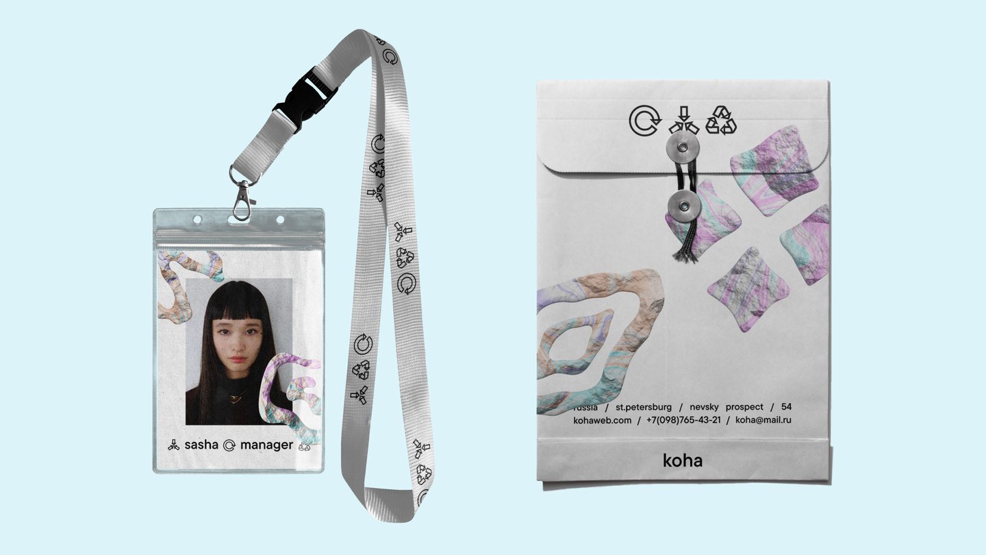
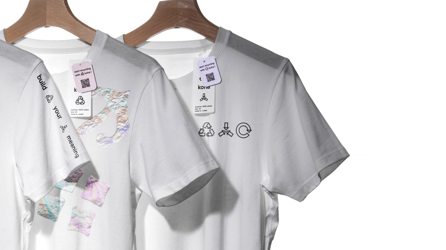
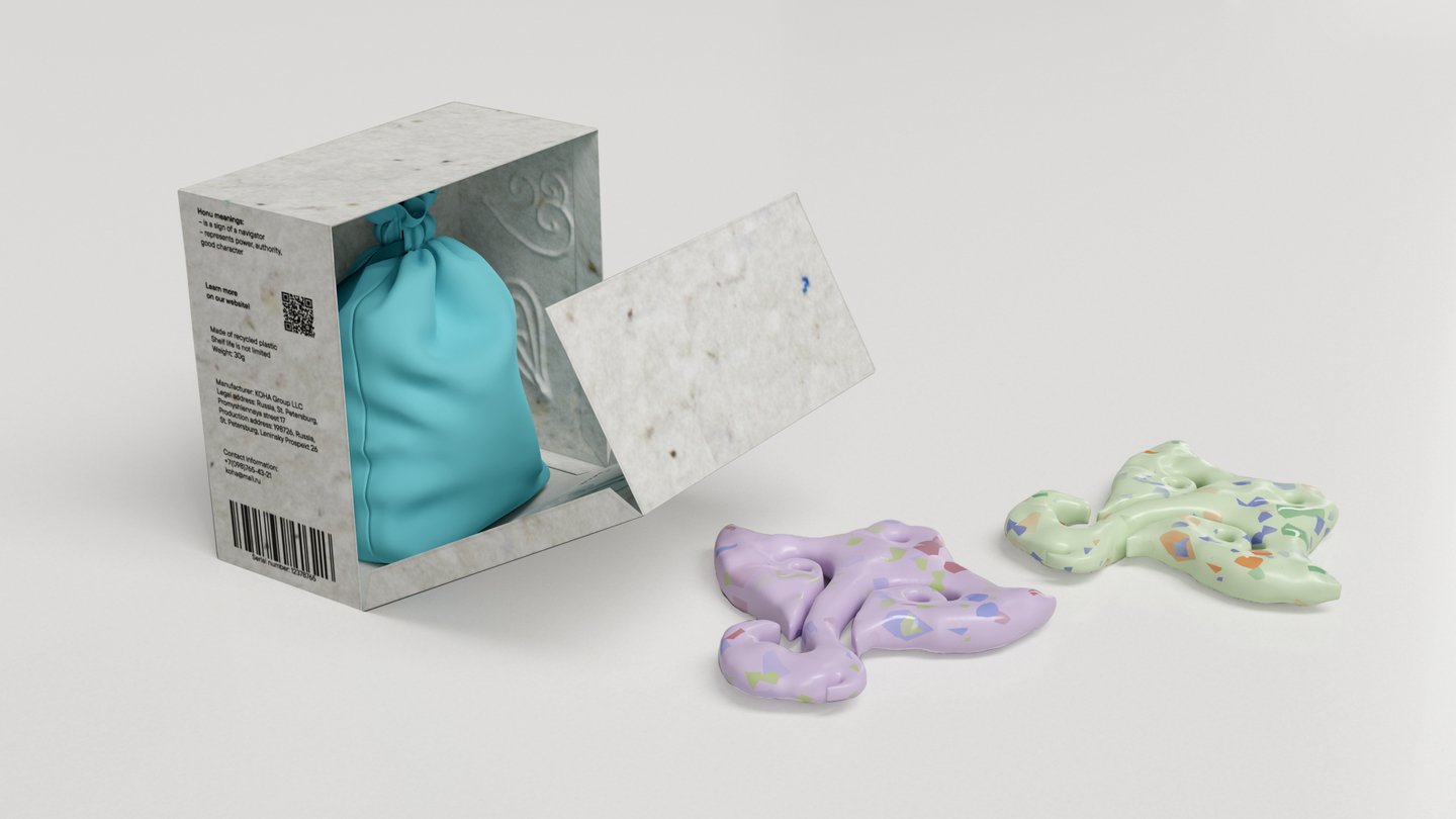
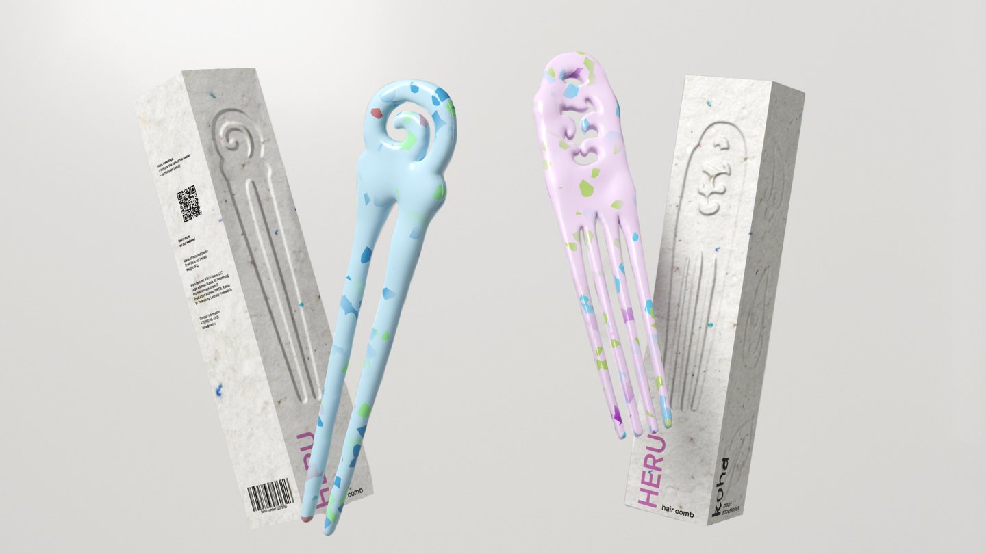
koha is a brand that creates jewelry with ornaments and meanings inherent to Māori culture. The distinguishing feature of the products is the rejection of natural materials such as bone or jade. Instead, 3D printing and recycled plastic are used, which makes the jewelry more accessible.The graphics are based on the idea of cultural modernization: textures of natural materials are combined with the idea of the significance of recycled plastic.

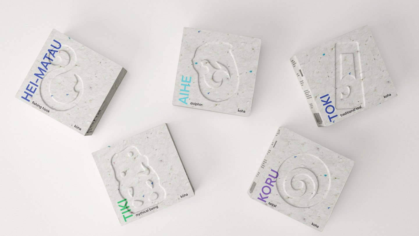
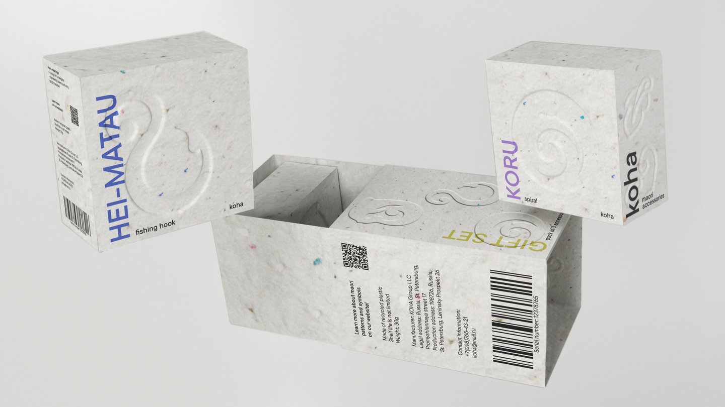
The packaging for koha was developed with a focus on the brand’s eco-friendly approach. The primary packaging includes pouches made of recycled cotton without a logo or brand name, which allows them to be reused for storing other jewelry or for other purposes. The secondary packaging is a box made of recycled cardboard that the buyer can dispose of themselves.As part of the project, individual packaging for the brand’s jewelry was created, as well as gift boxes for sets of 3 and 6 items.
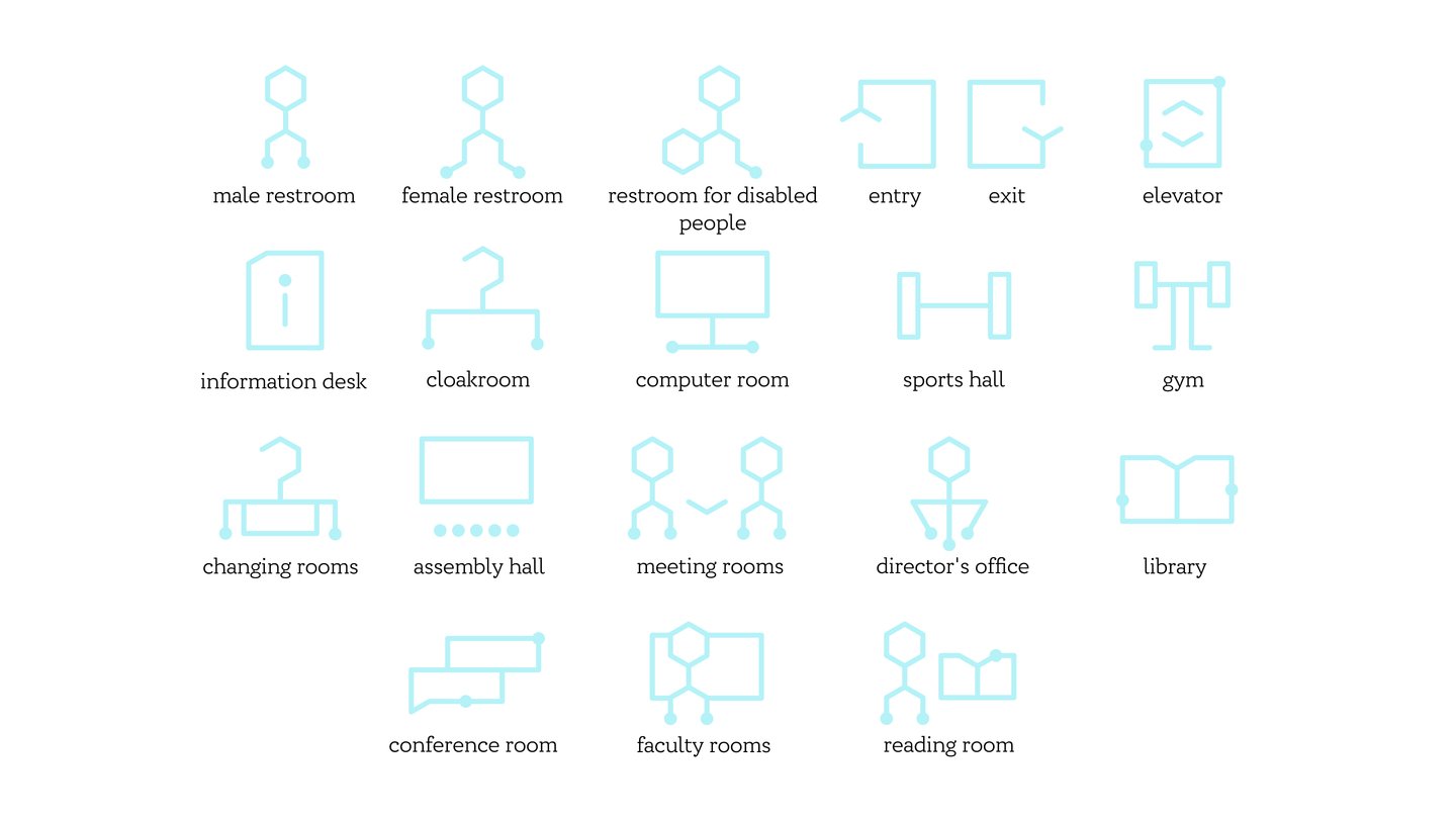
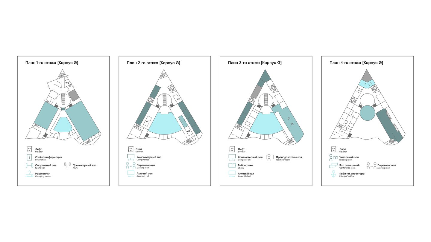
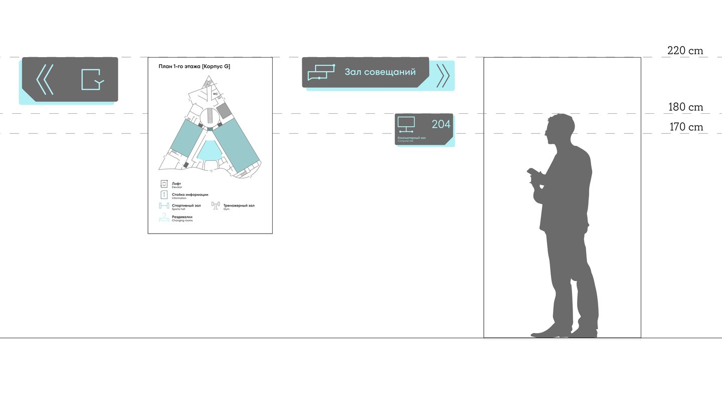
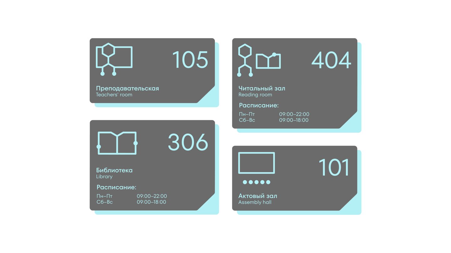
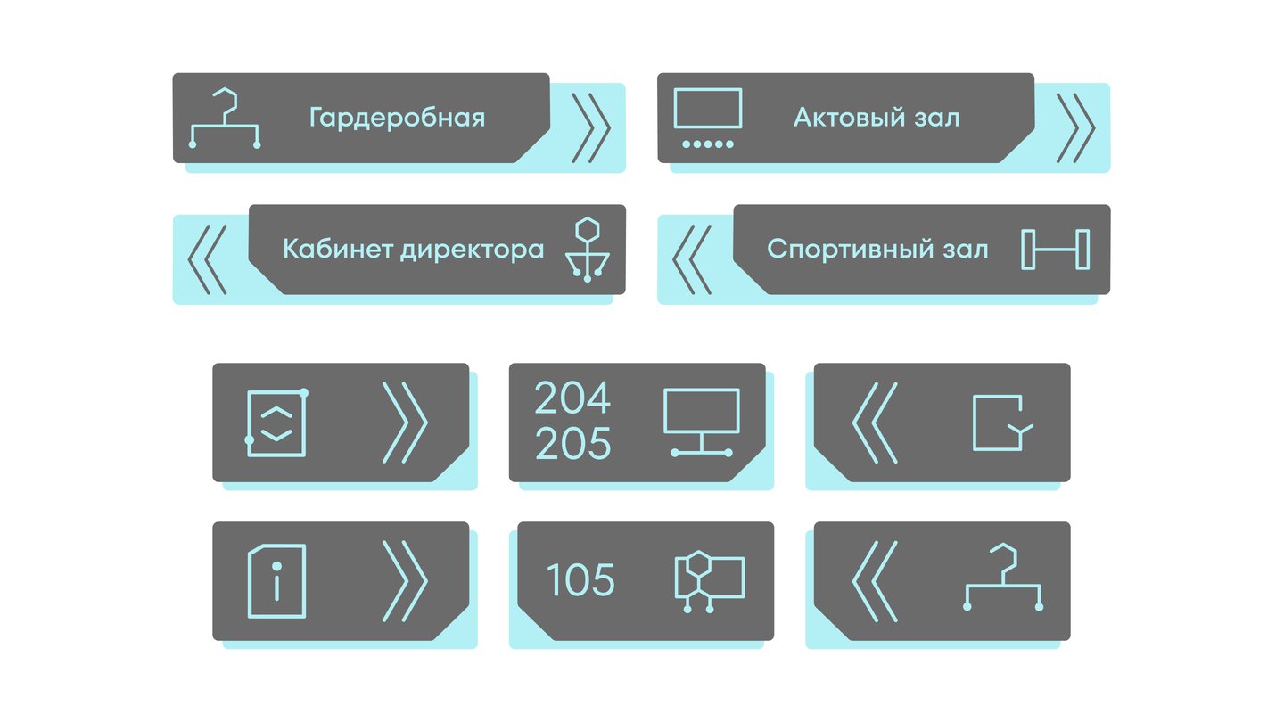
NMRC named after V. A. Almazov is a project-based scientific campus that combines living space for medical students with a venue for conferences, symposia, and research. The project’s task was to develop an intuitive navigation system that would allow visitors to avoid wasting time searching for and interpreting signs.The core concept is the unification of graphic elements based on the principle of a chemical reaction scheme. The pictograms are built on a single grid based on the shape of a hexagon. An additional element is dots, which may be used either at the open ends of lines or along the contour of the pictogram.

Multi-page Publications
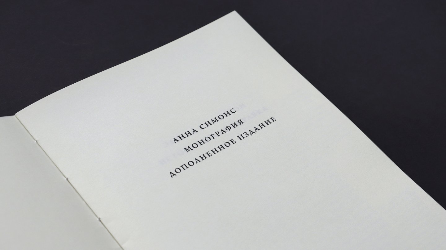
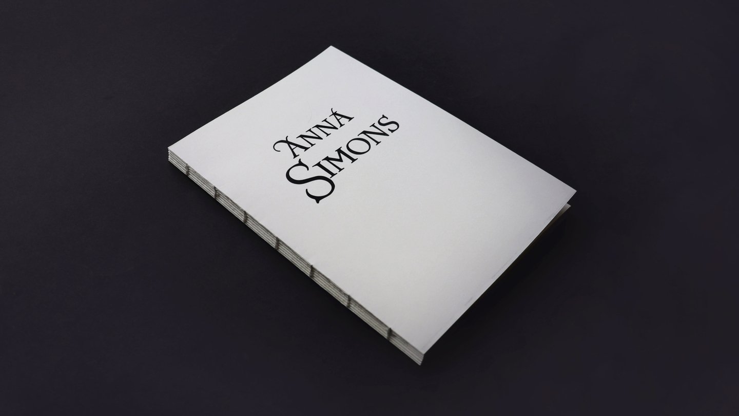
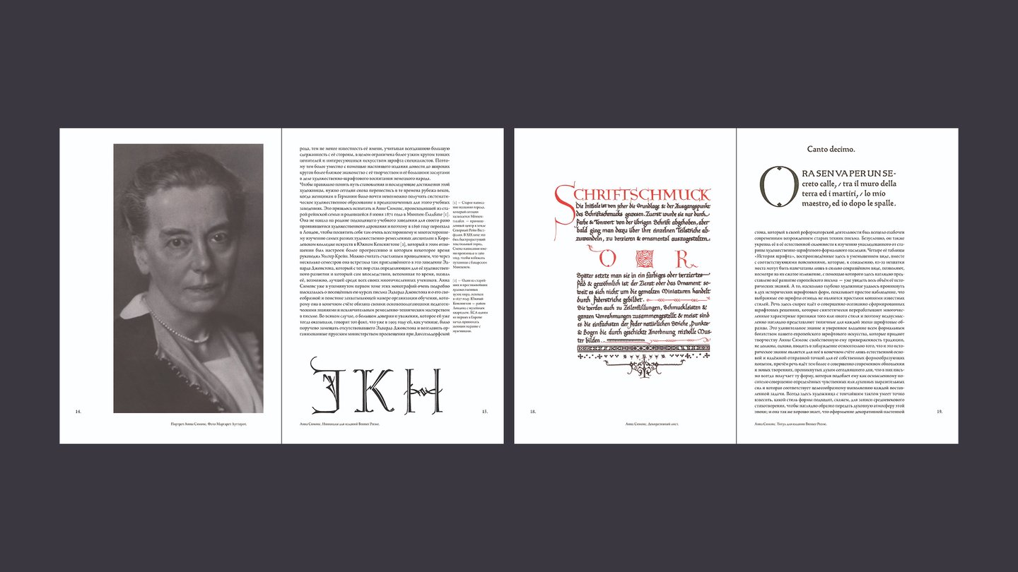
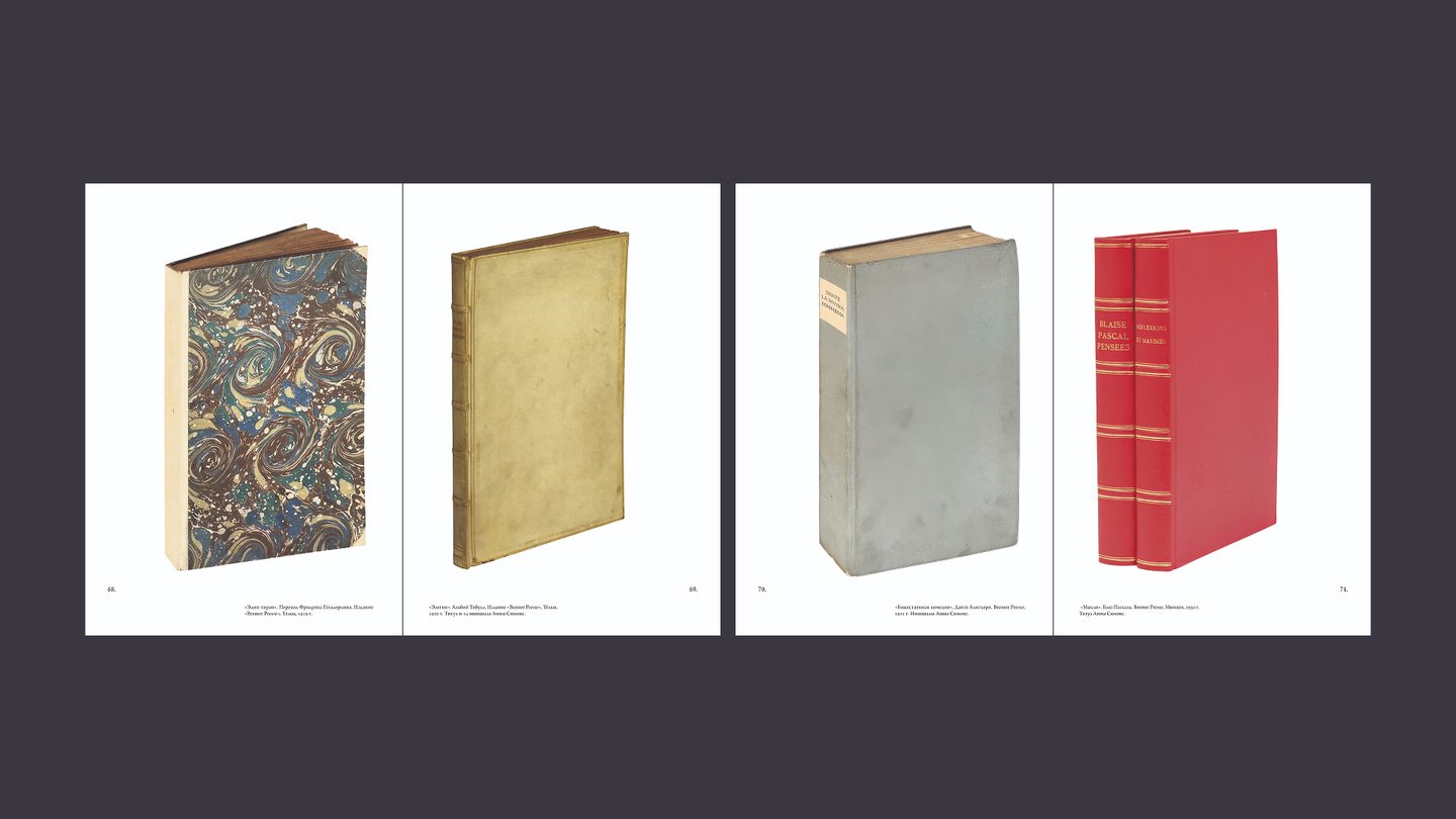
Anna Simons is one of the key figures in the history of 20th-century calligraphy, one of the first to bring the ideas of the Arts & Crafts movement to Germany. At the same time, research on her work and texts about her life are practically unavailable in the public domain, and in Russian they do not exist at all. The goal of the project is to create an expanded reissue of the monograph about Anna Simons translated into Russian, supplemented with accompanying materials on the topic.
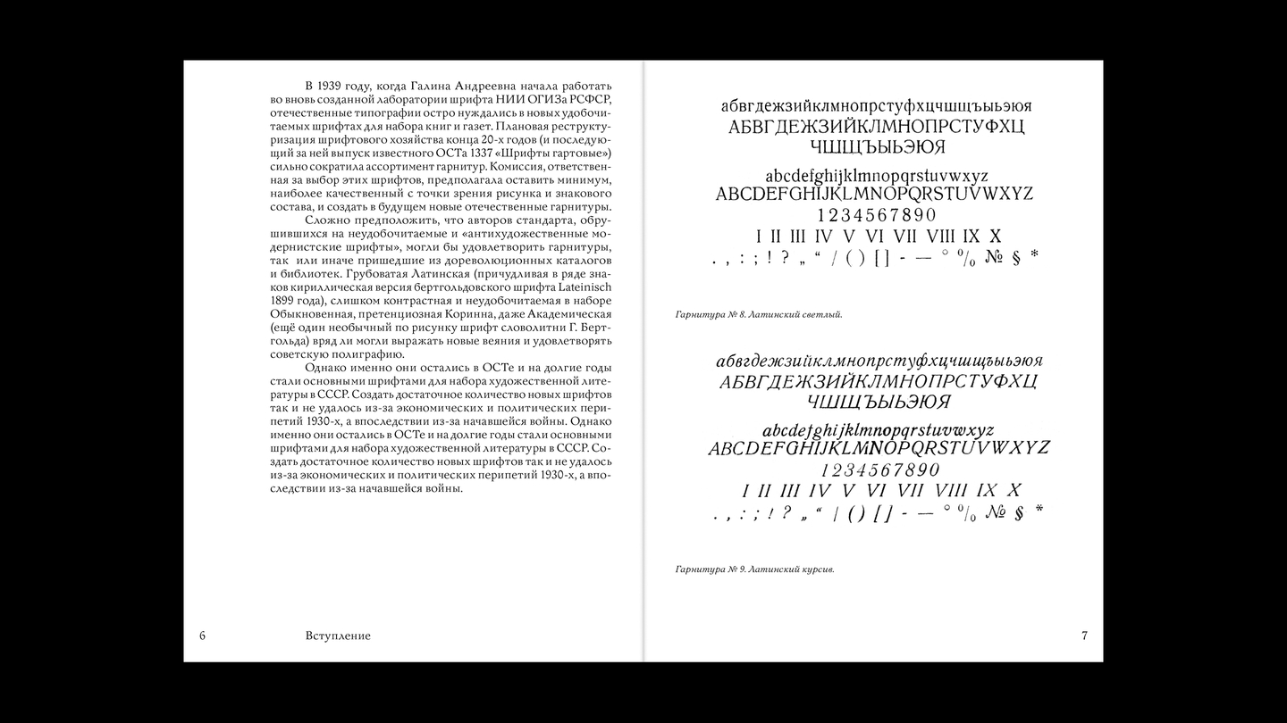
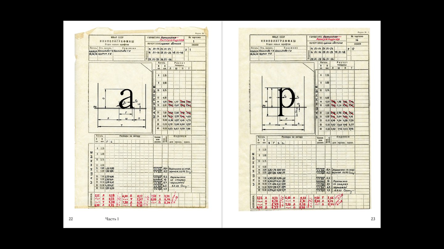
Galina Bannikova and her typefaces is an exhibition dedicated not only to the works but also to the methods and core principles behind the creation of typefaces by Galina Bannikova, a Soviet artist and typographer. The exhibition catalogue is a research essay on Bannikova’s working method, in which the text is supported by sketches, production materials, and drafts.