Original size 2470x3500

Rebranding of the UNIGYM network of fitness clubs
Longread translated automatically
The project is taking part in the competition
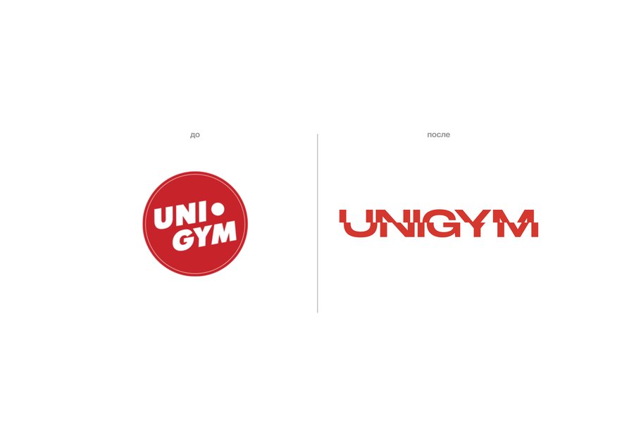
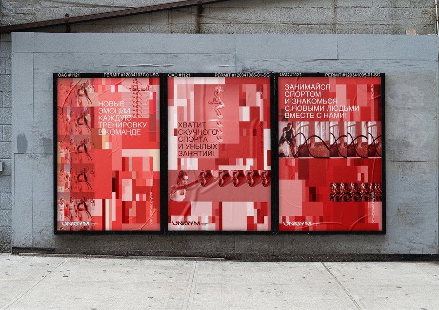
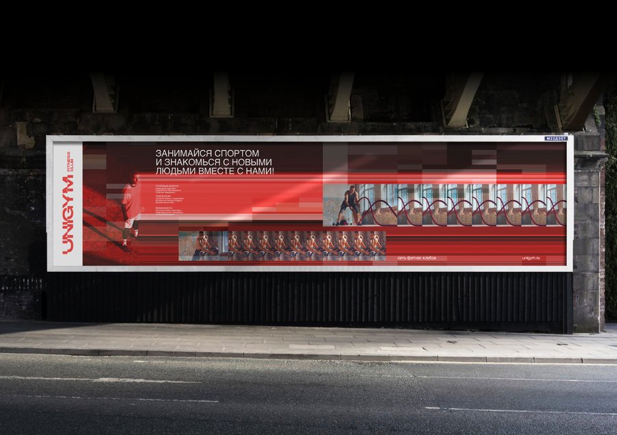
The task of rebranding was to update the brand and give it a new impetus while preserving its previous characteristics. An analysis of the target audience and an audit design of the brand was conducted. As a result, a new identifier of the UNIGYM network was developed. The brand’s metaphor is the gym that gives new impressions. The aesthetics of glitch and pixels reflect the essence of motion, multilayerity and bold unexpected combinations. Inspired by this branding consists of repeated elements and flows of lines that create visual harmony in each aspect.

Original size 2480x1750

Original size 2480x1750

Original size 2480x1750
Original size 2480x1750
Original size 2480x1750
Original size 2480x1750
Original size 2480x1750
Original size 2480x1750
Original size 2480x1750
Original size 2480x1750
Original size 2480x1750
Original size 2480x1750
Original size 2480x1750
More projects in identity & branding
We use cookies to improve the operation of the HSE website and to enhance its usability. More detailed information on the use of cookies can be fou...
Show more


