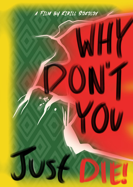
A simple approach of reinterpretation of the Why Don’t You Just Die! poster uses a striking contrast of red and green, split by a jagged, almost violent tear, symbolizing the film’s intense conflicts. The rough, hand-drawn typography adds a raw energy, reflecting the chaotic and unpredictable nature of the story. With its vibrant yellow edges and distressed textures, the design radiates tension, suspense, and an unhinged sense of danger.
Другие проекты c тегом плакат
Мы используем файлы cookies для улучшения работы сайта НИУ ВШЭ и большего удобства его использования. Более подробную...
Показать больше